Prana Kitchens
THE APPROACH
As wellness became increasingly commercialised, many pantry brands found themselves caught between two extremes: highly clinical nutrition products or traditionally packaged Indian staples that felt rooted in nostalgia but disconnected from modern lifestyles.
Prana Kitchens set out to build something different.
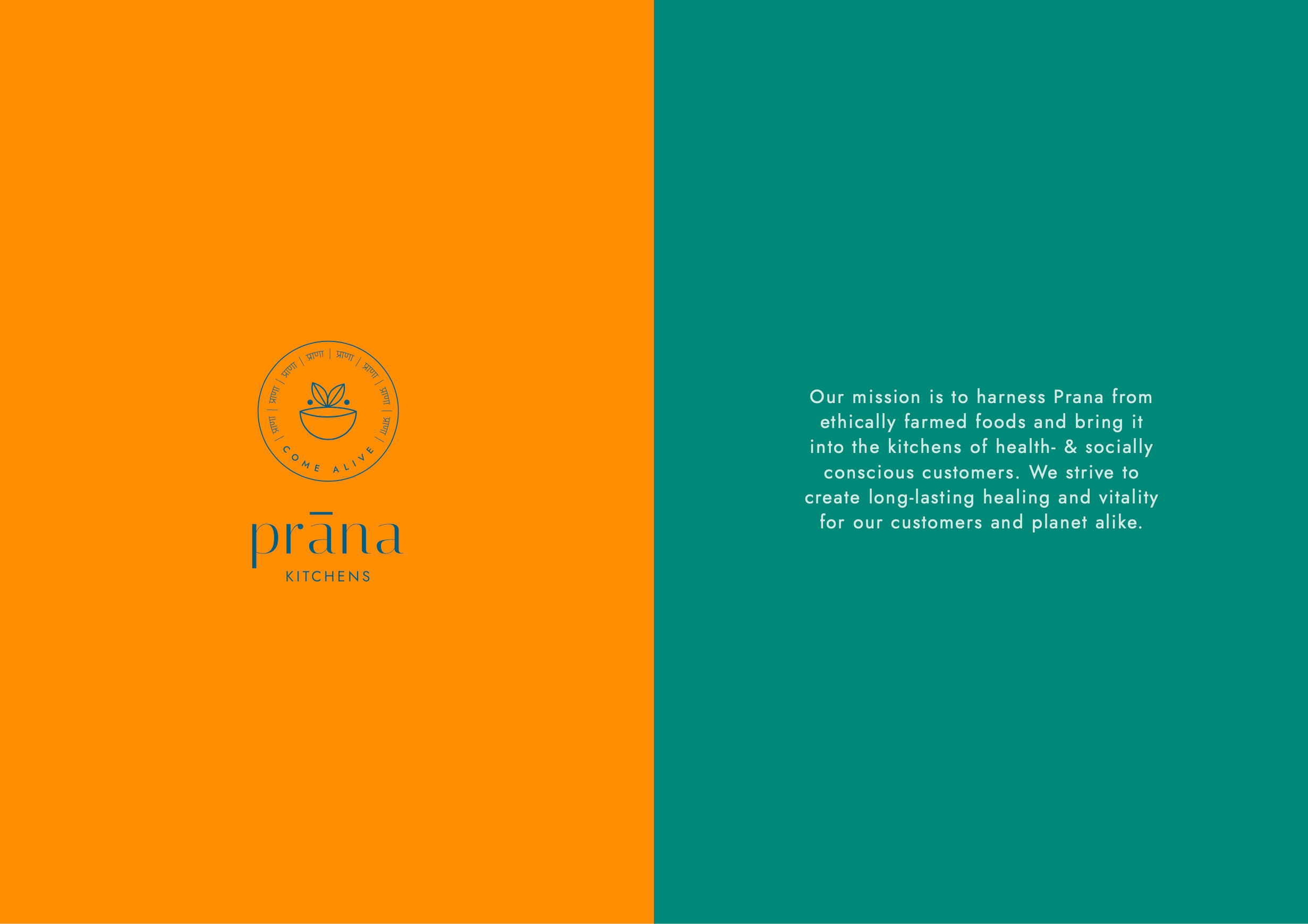
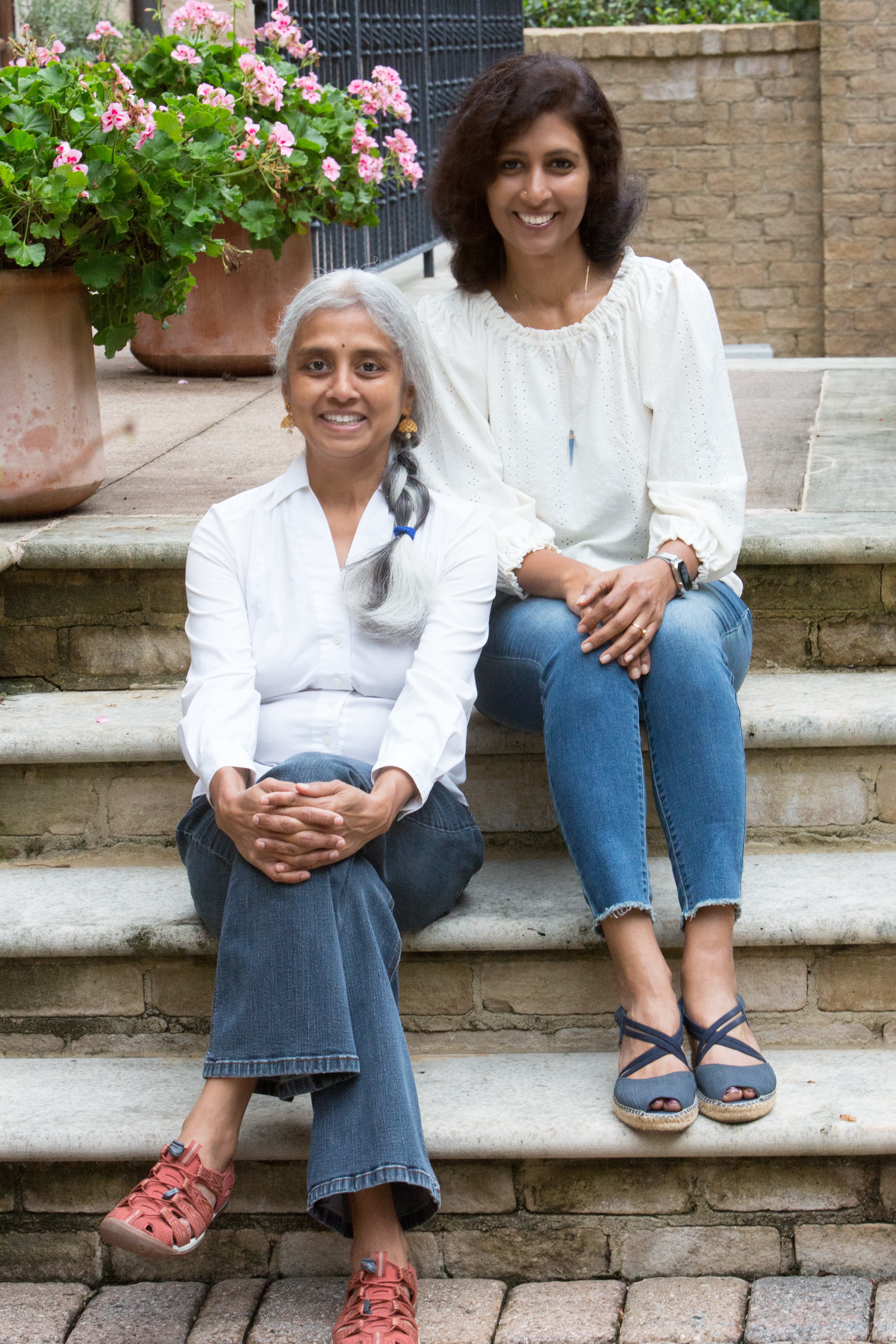
Founded on the belief that food should nourish both body and mind, Prana Kitchens brings together time-honoured Indian ingredients, Ayurvedic wisdom and everyday rituals in products designed for the modern kitchen. Rather than positioning wellness as a trend, the brand sought to make mindful eating feel approachable, beautiful and deeply connected to its origins.
BUILDING A MODERN INDIAN PANTRY BRAND
The challenge wasn’t introducing consumers to Indian ingredients. It was helping them see them differently.
Competitive research revealed a category split between highly vibrant, ingredient-led brands and minimalist wellness brands, with few successfully balancing authenticity and contemporary design. The opportunity lay in creating a visual identity that felt calm without becoming sterile, premium without feeling exclusive, and deeply rooted in Indian culture without relying on familiar clichés. The strategic direction emphasised nostalgia, mindfulness, slow living and community as the emotional foundation of the brand.
BRAND STRATEGY
Brand purpose: Prana Kitchens exists to reconnect people with the rituals of mindful cooking through thoughtfully sourced ingredients and contemporary pantry essentials.
The strategy positioned the brand around the idea that wellness isn’t achieved through perfection or restriction, but through consistent everyday rituals. Rather than competing solely on health claims, Prana Kitchens celebrates the stories behind ingredients, the people who grow them and the traditions that have shaped them for generations.
Brand keywords including Soulful, Nostalgia, Growth, Mindfulness, Balance and Slow Transformation became the foundation for every creative decision, influencing everything from typography and illustration to packaging and digital design.

BRAND IDENTITY
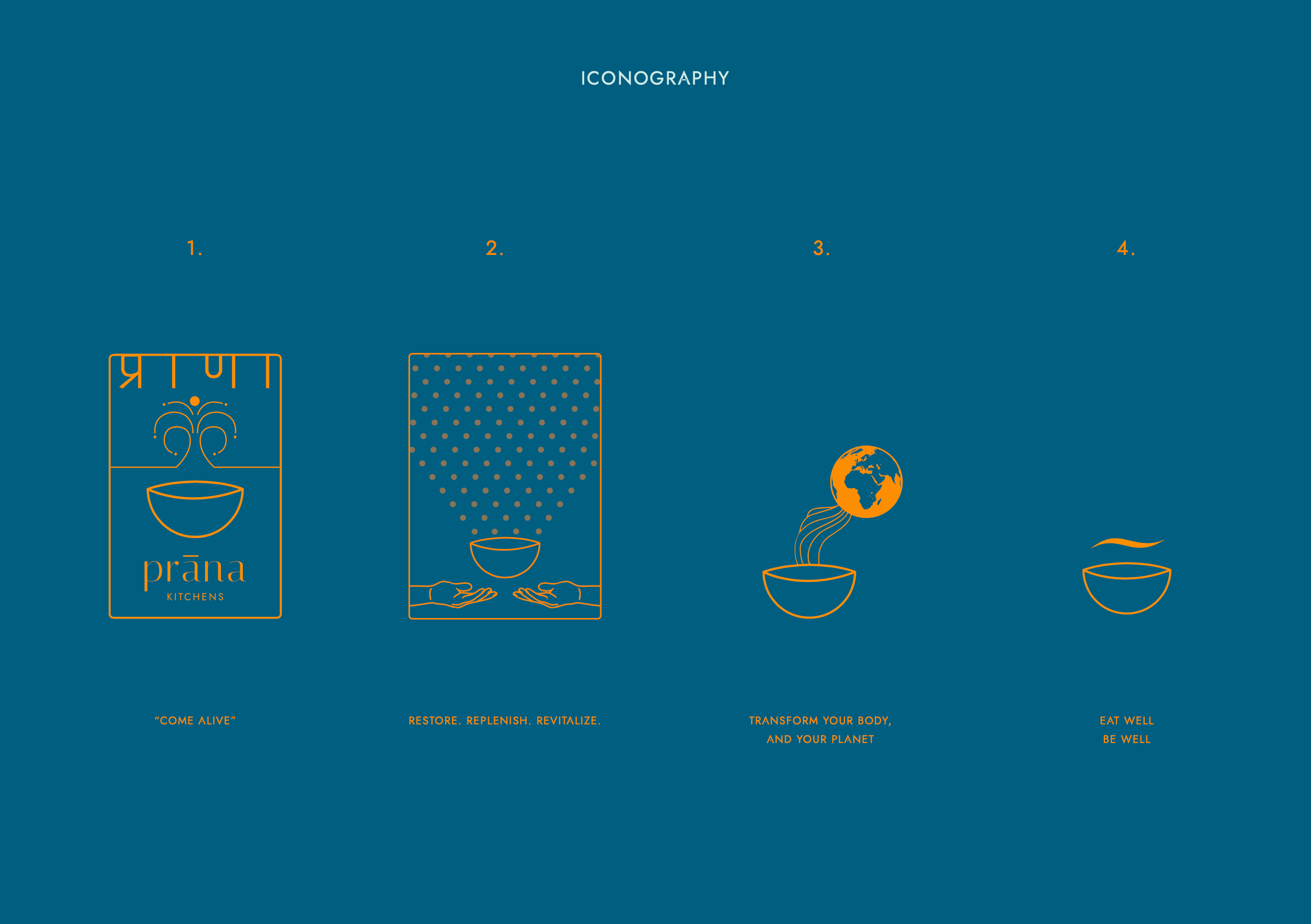
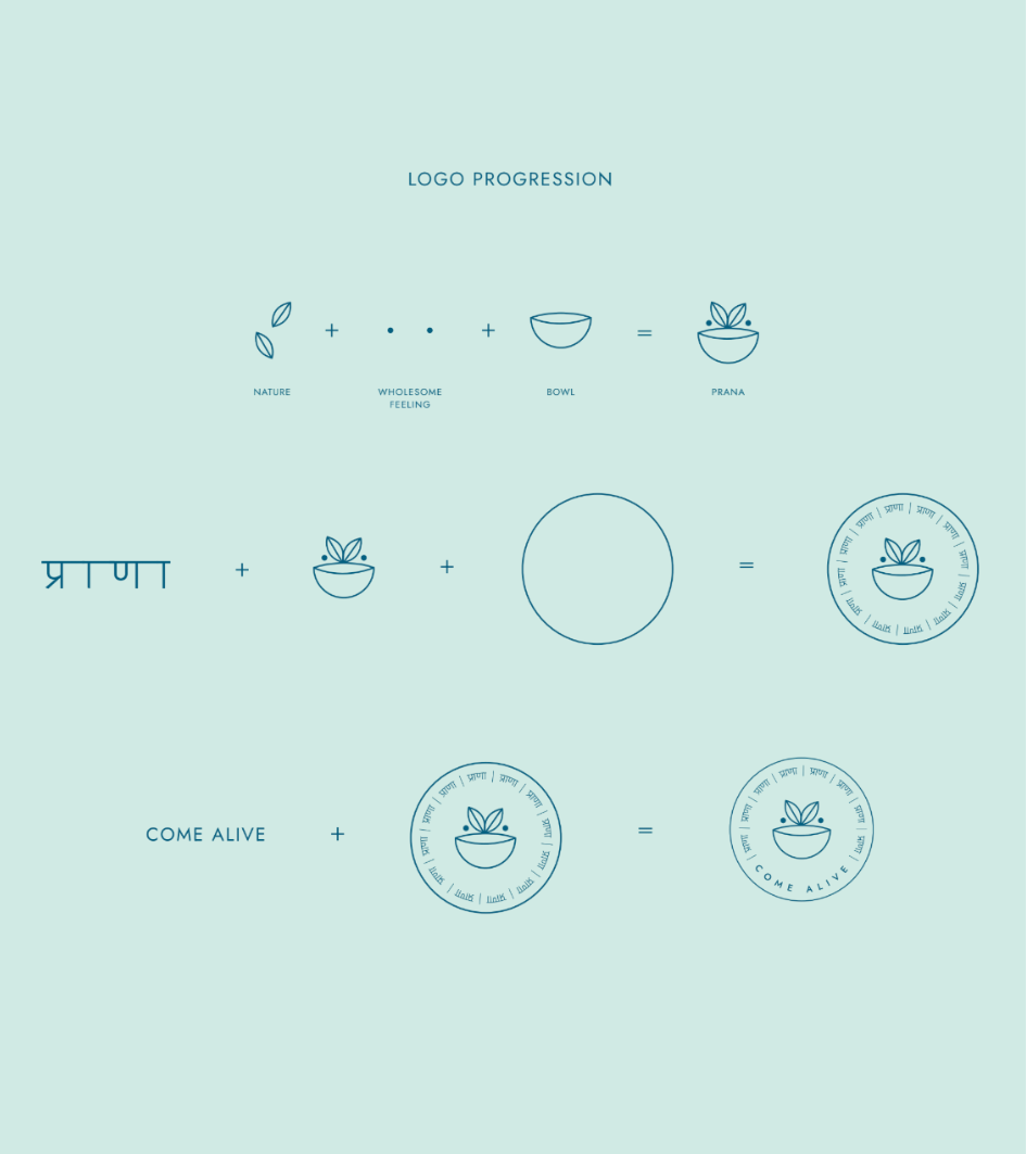
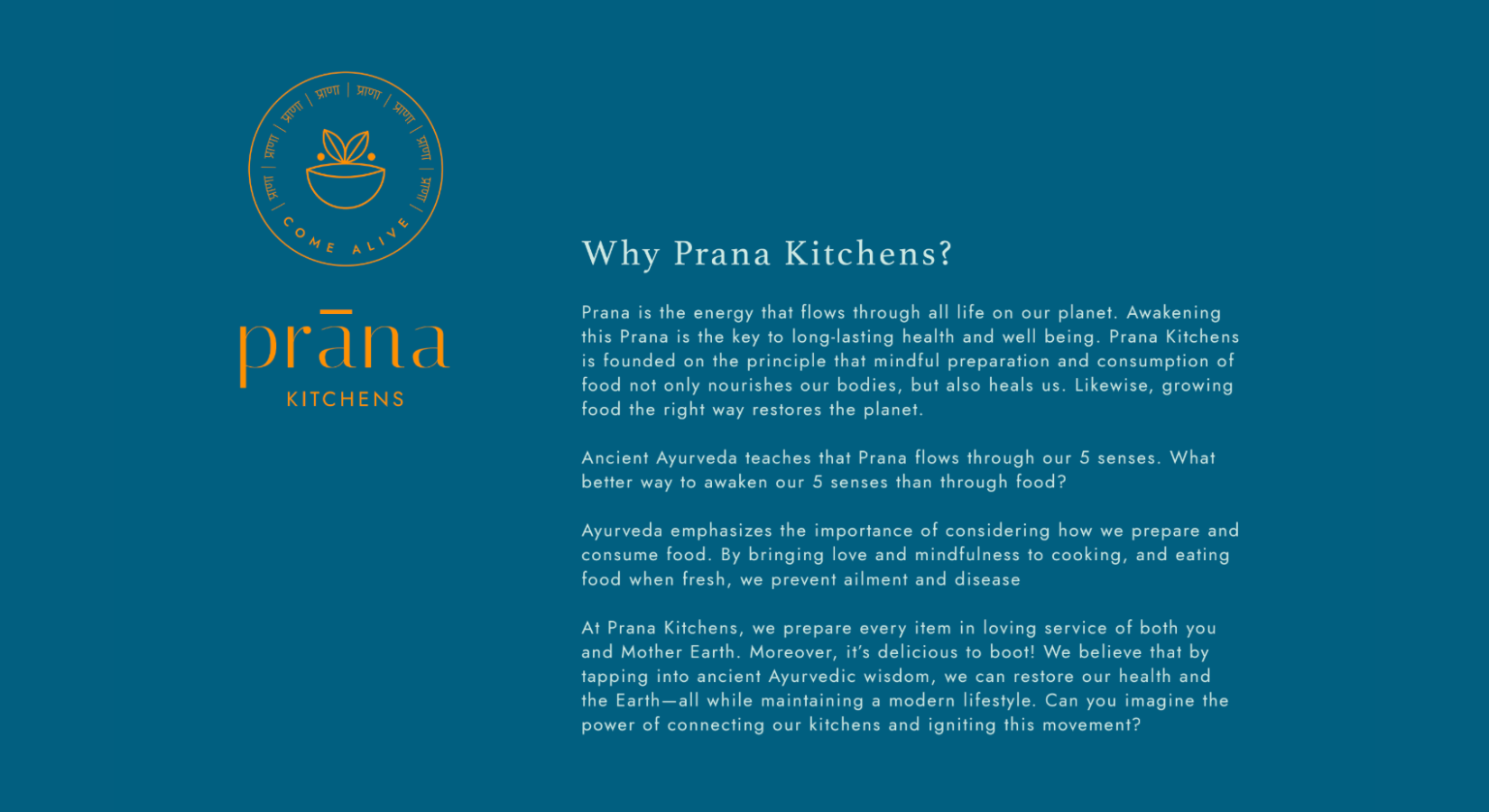
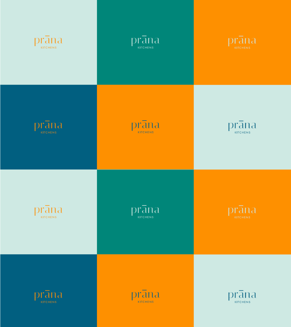
The identity was designed to feel timeless, warm and quietly confident.
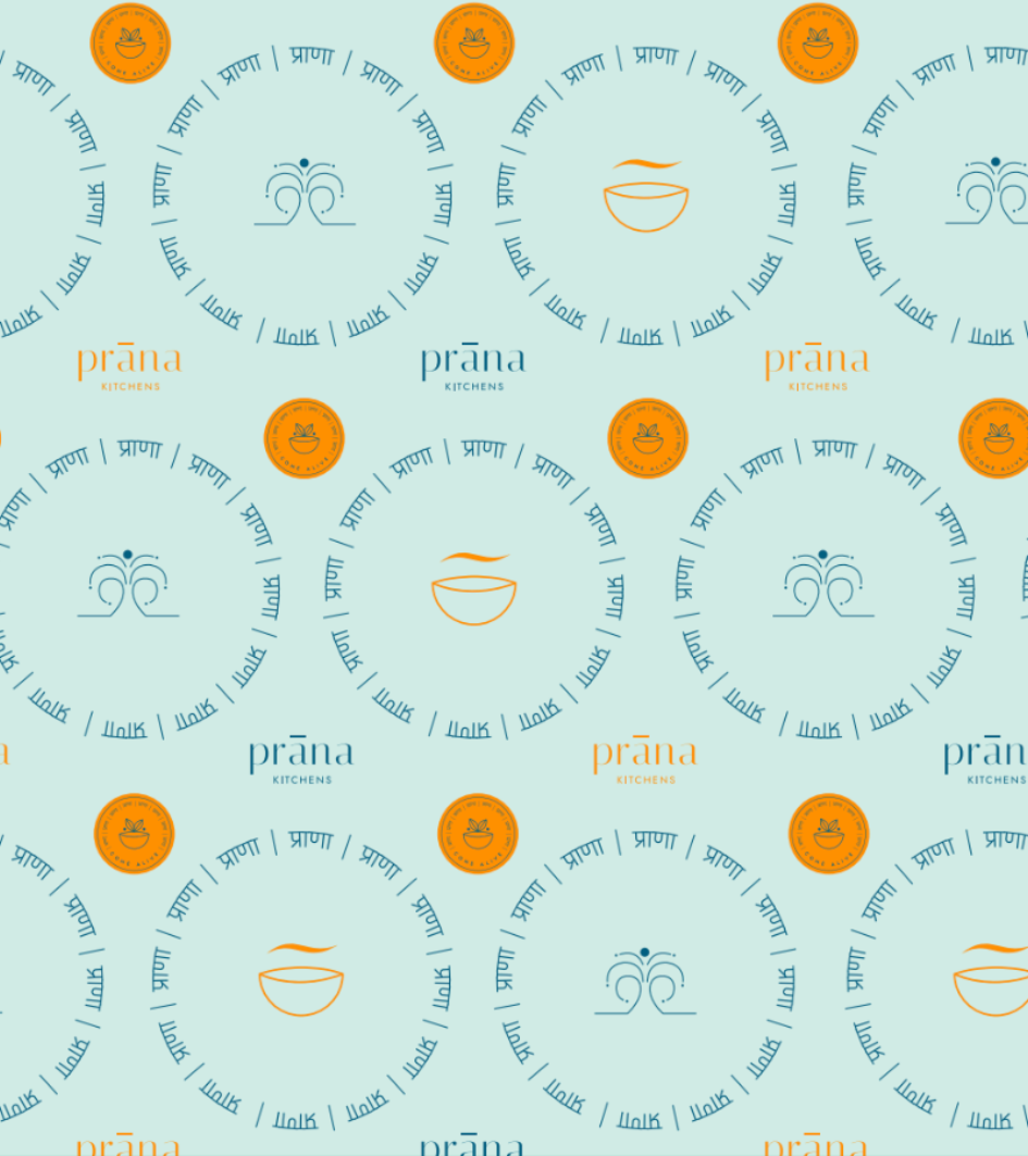
Drawing inspiration from everyday Indian rituals and contemporary editorial design, the visual language combines restrained typography with earthy colour palettes and handcrafted illustration. The result is a brand that feels equally at home in a modern pantry as it does in traditional kitchens, speaking to both South Asian audiences and a broader community interested in intentional living.
Rather than overwhelming the products with decorative elements, the identity prioritises clarity, storytelling and emotional connection.
PACKAGING
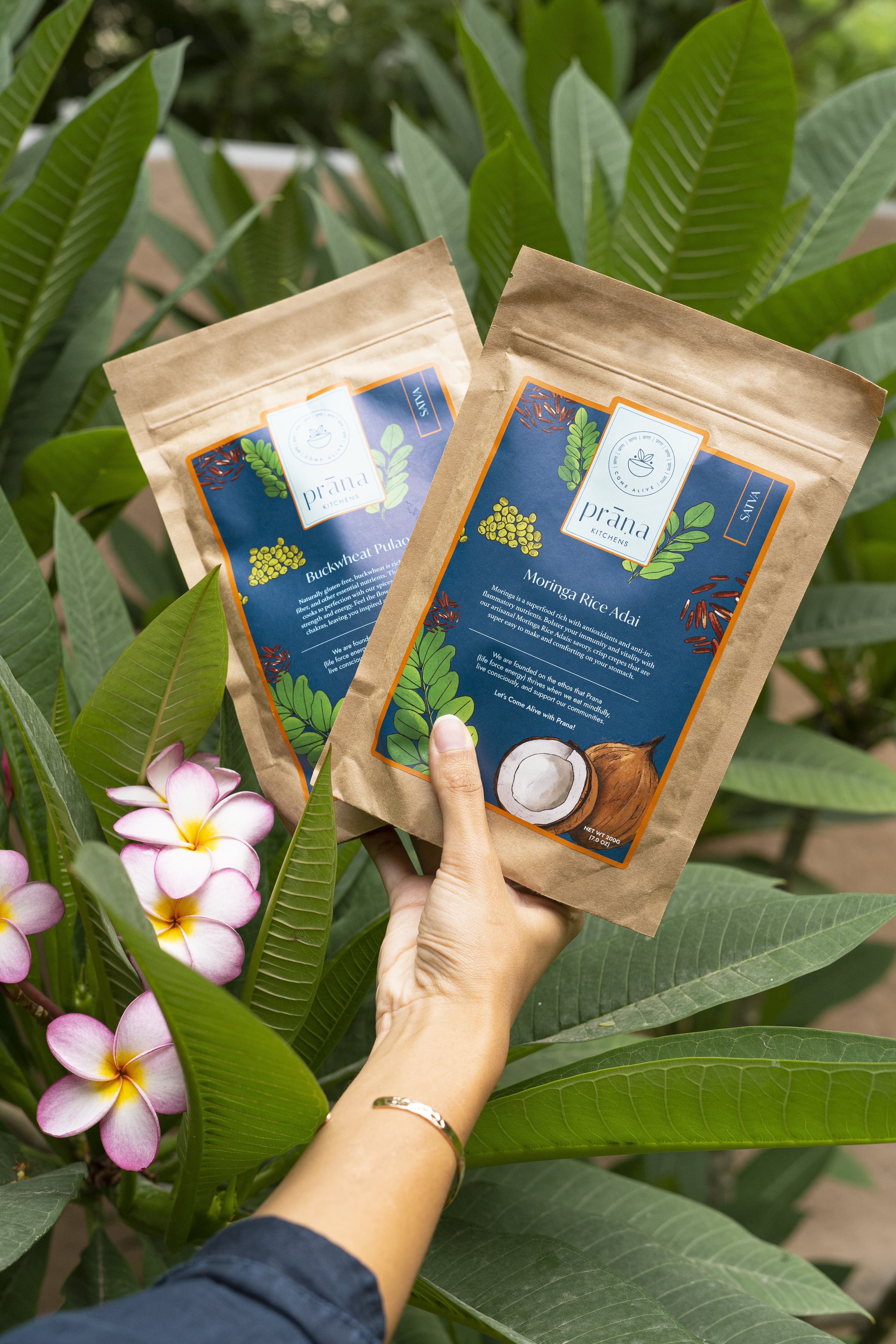
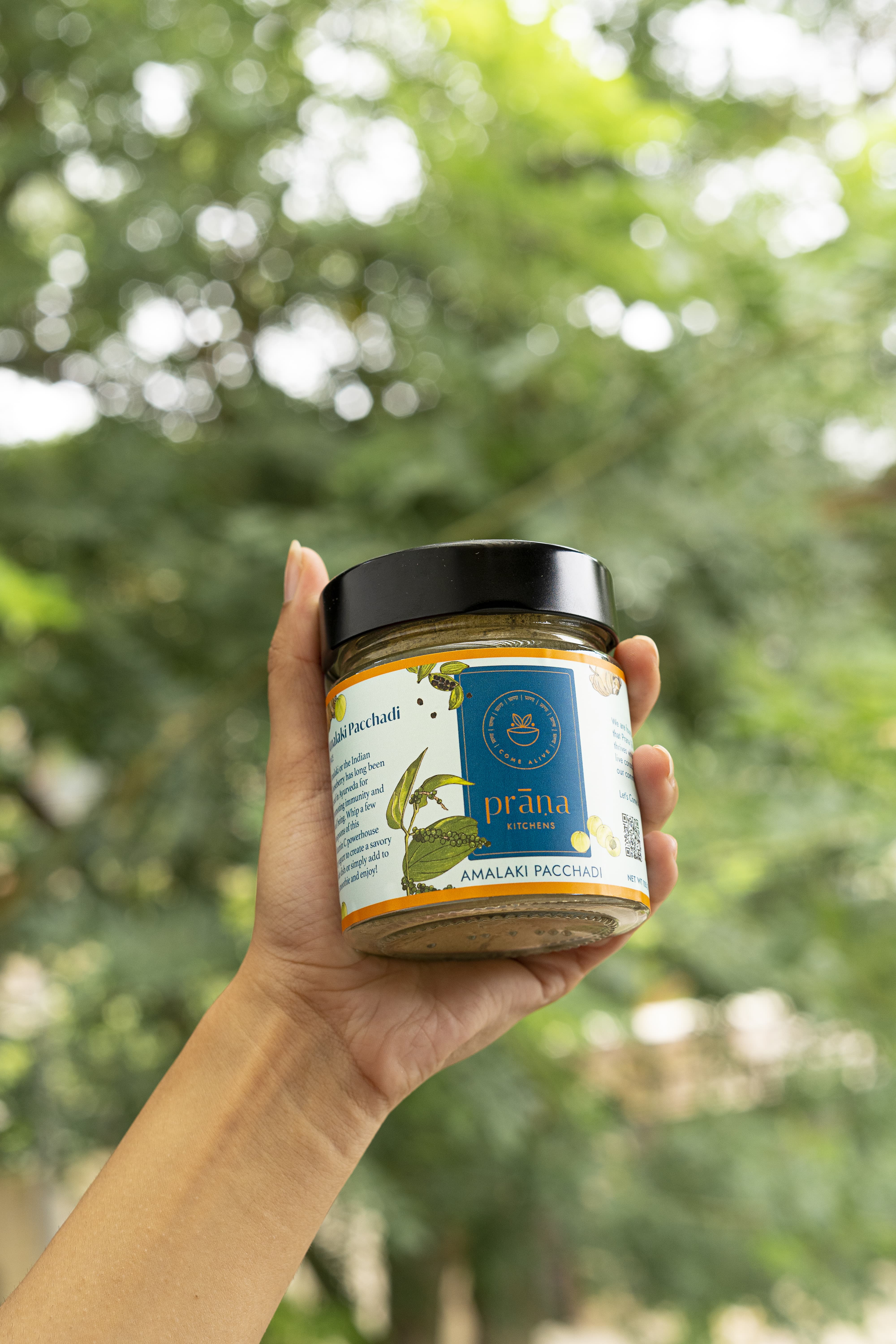
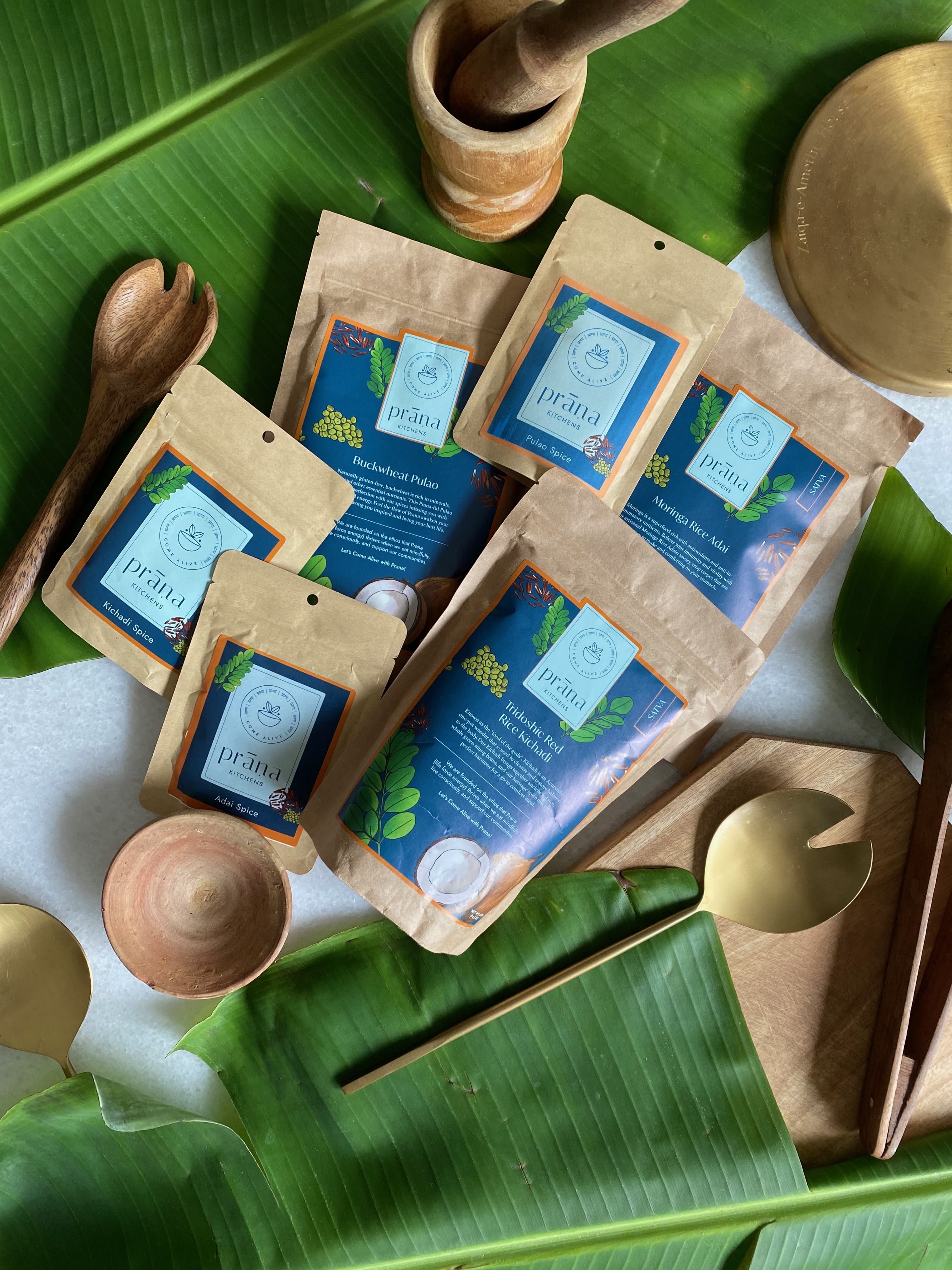
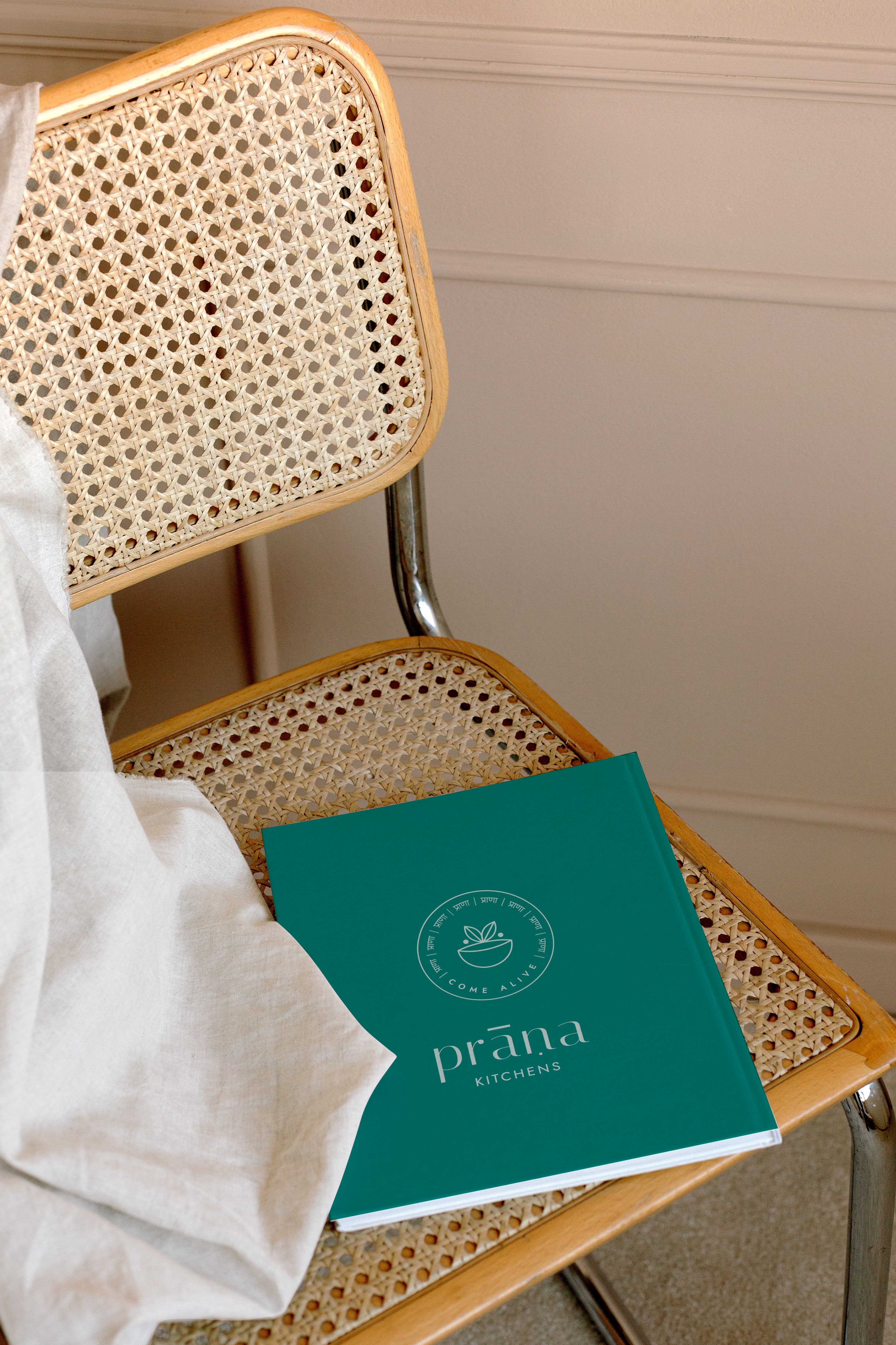
Packaging became the primary expression of Prana Kitchens’ philosophy.
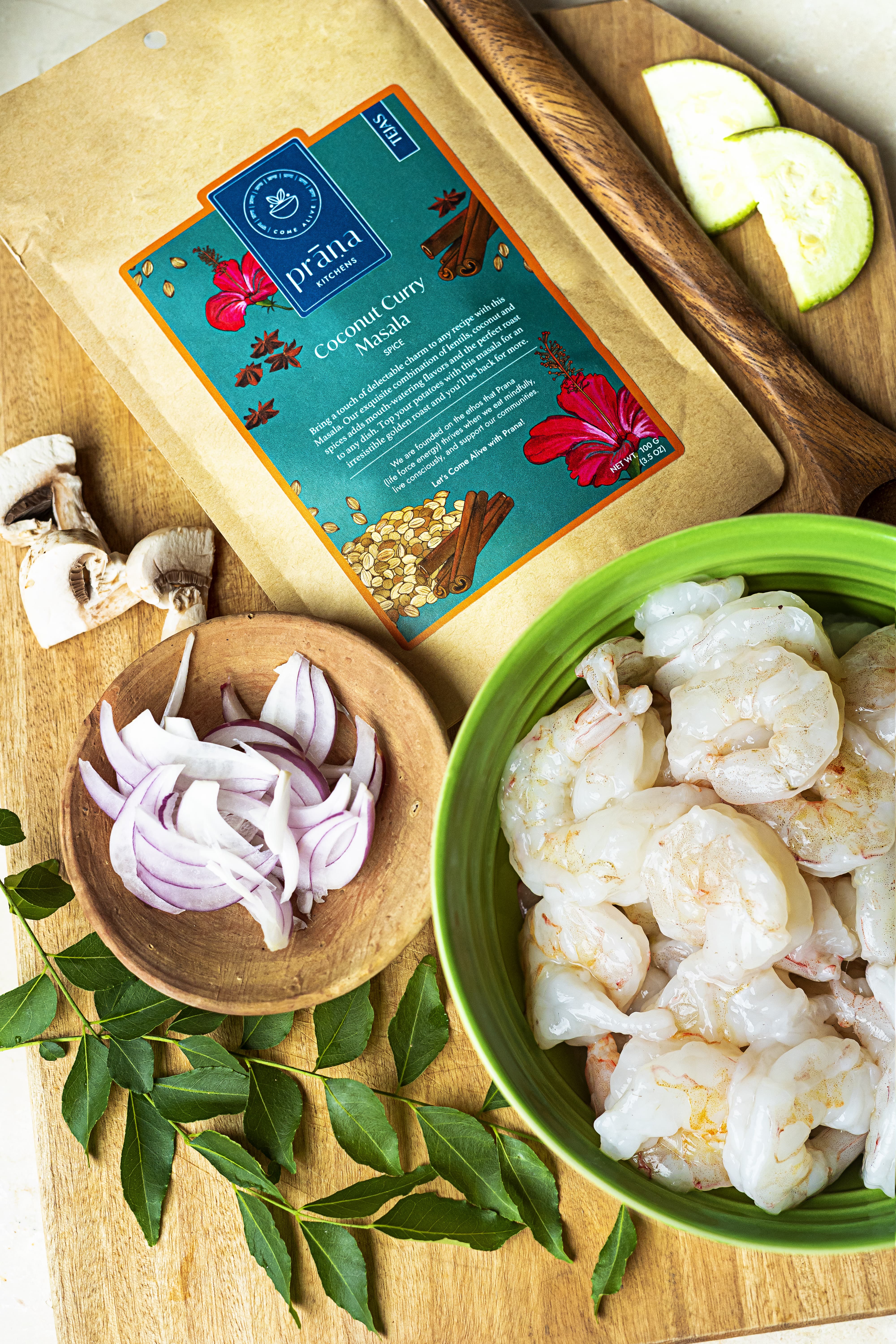
Each product was designed to communicate not only what it contains, but where it comes from and the journey behind every ingredient. A custom illustration system celebrates the movement from farm to kitchen, depicting ingredients in their natural environment alongside moments of cooking, gathering and sharing food. This visual language reinforces the brand’s commitment to transparency, craftsmanship and mindful consumption.
The packaging architecture was intentionally built as a scalable system, allowing diverse product categories, from spice blends and pantry staples to snacks and wellness products, to feel unmistakably part of one cohesive family.
WEBSITE
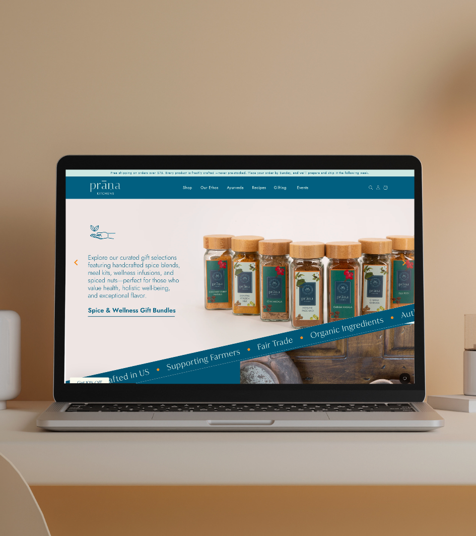
The website extends the same sense of warmth and intentionality into the digital experience.
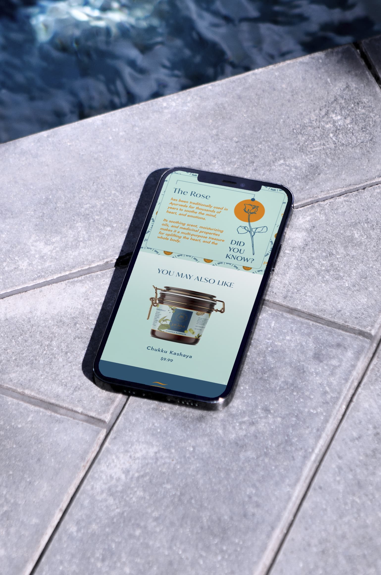
Designed as more than an ecommerce platform, it combines storytelling, recipes, ingredient education and product discovery within a calm, editorial-inspired interface. Rich photography, custom illustrations and generous spacing create an experience that mirrors the pace and philosophy of the brand itself, encouraging visitors to explore ingredients, cooking traditions and mindful rituals alongside the products.
THE RESULT
Prana Kitchens launched with a cohesive brand ecosystem that connects identity, packaging, illustration and digital experience through one consistent philosophy.
Grounded in research and inspired by the rituals surrounding food, the brand successfully positions Indian pantry staples within a contemporary wellness landscape without compromising authenticity. The resulting identity system provides a scalable foundation for future product launches while creating a memorable brand that celebrates nourishment, craftsmanship and slow living.
PROJECT CREDITS
Creative Direction
Drashti Sheth
Website Development
Dilip Sharma
Additional Illustrations
Ramyani Ghosh & Adinda Shafira
Website Design, Identity & Brand Illustrations
Mahima Dhawan
Client
Aruna Sankaranarayanan & Sri Giridharan, Founders, Prana Kitchens