Kiskadee Coffee
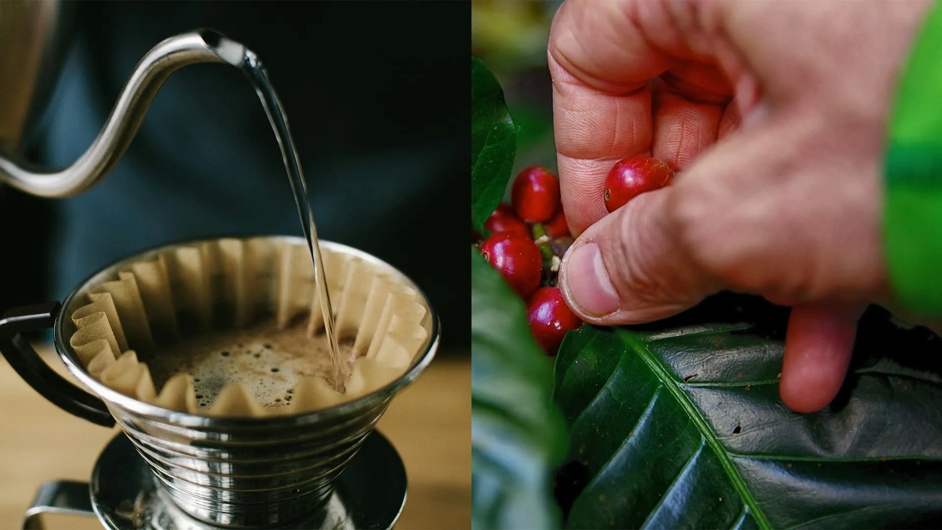
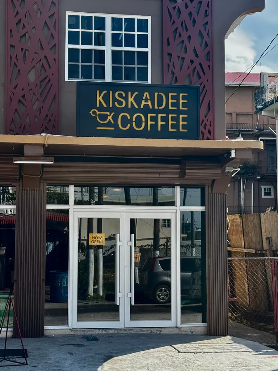
Guyana's cafe scene skews sit-down, from long-running local favourites to the occasional international chain, none of them built for someone who wants a well-made drink and five minutes, not a table. A growing urban population, a food culture shaped by Indian, African, Amerindian, and European influence, and a rising appetite for imported ideas like third-wave espresso and mobile ordering had no domestic home yet.
Kiskadee set out to fill that space: the first Guyanese coffee brand built specifically to be quick, high-quality, and unmistakably local, rather than a copy of an international name.
Positioning Statement: A coffee brand doesn't have to choose between craft and culture. The best ones brew both into the same cup.
BRAND STRATEGY
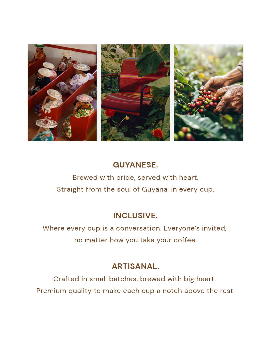
Before a single visual was drawn, Aam mapped the cultural terrain: Guyana's layered history, its local coffee competitors, its consumer habits, and even what Guyanese youth were watching on TikTok. That research set three non-negotiables for the brand: it had to feel unmistakably Guyanese, reflect the country's mixed heritage, and read as premium without losing warmth. Those three principles (Guyanese, Inclusive, Artisan) became the filter for every decision that followed.
BRAND IDENTITY
Wordmark
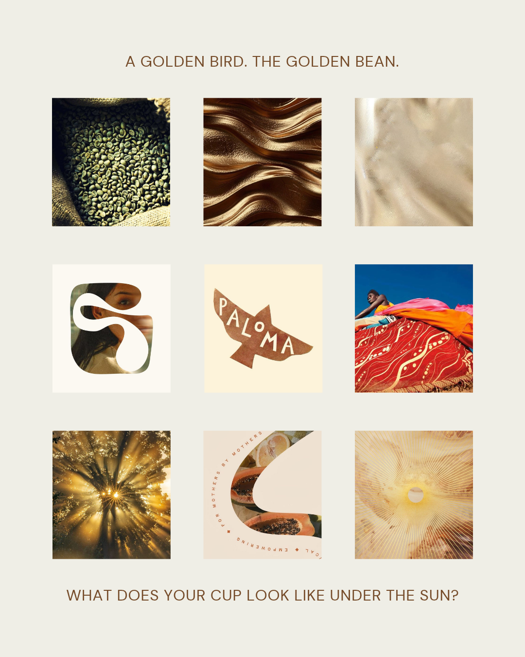
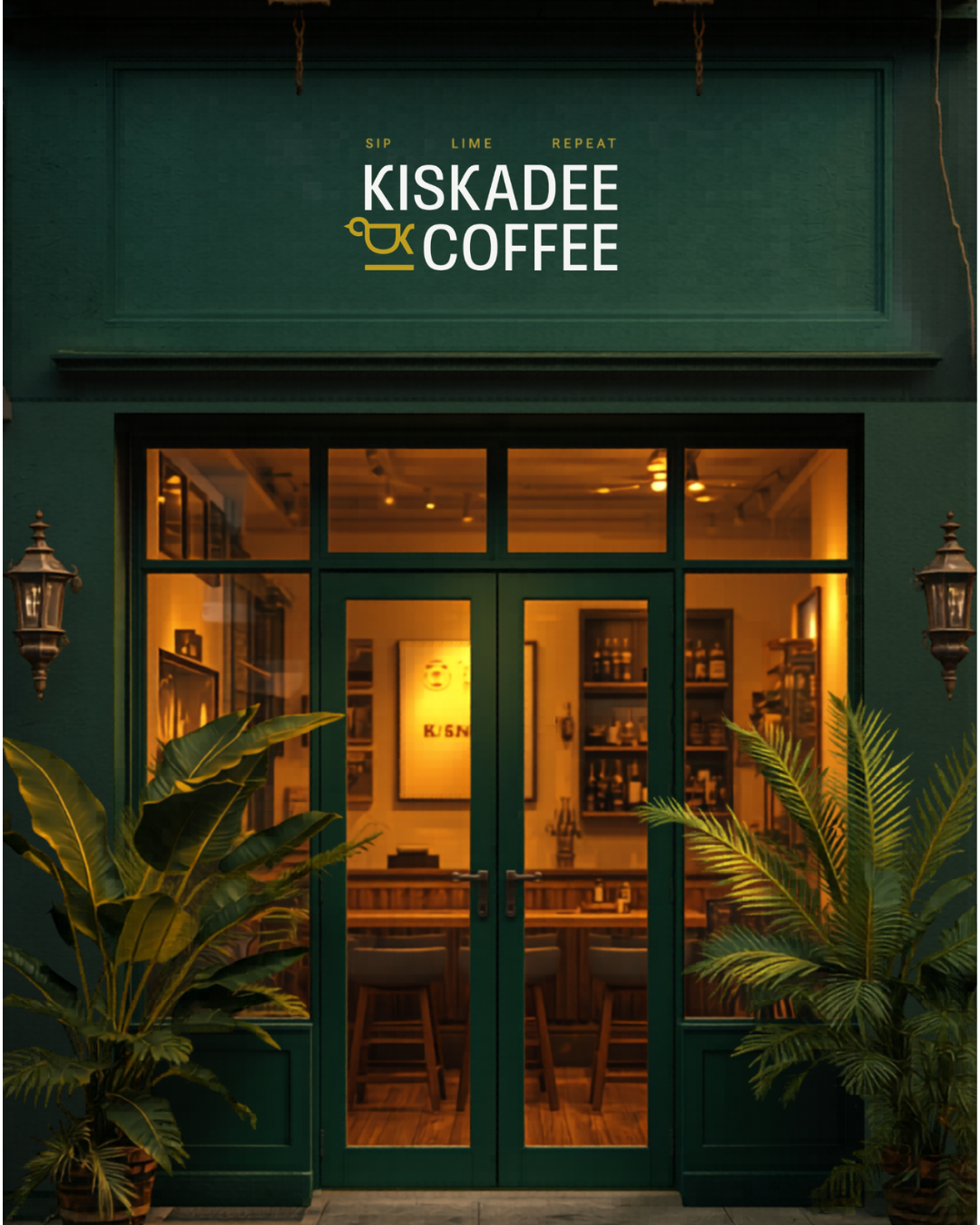
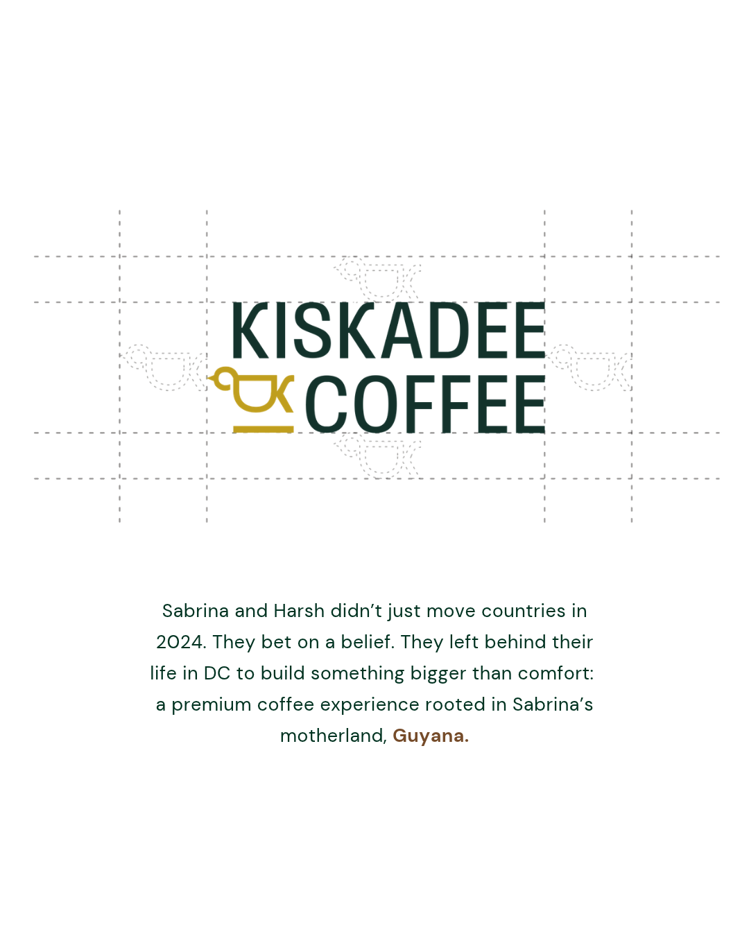
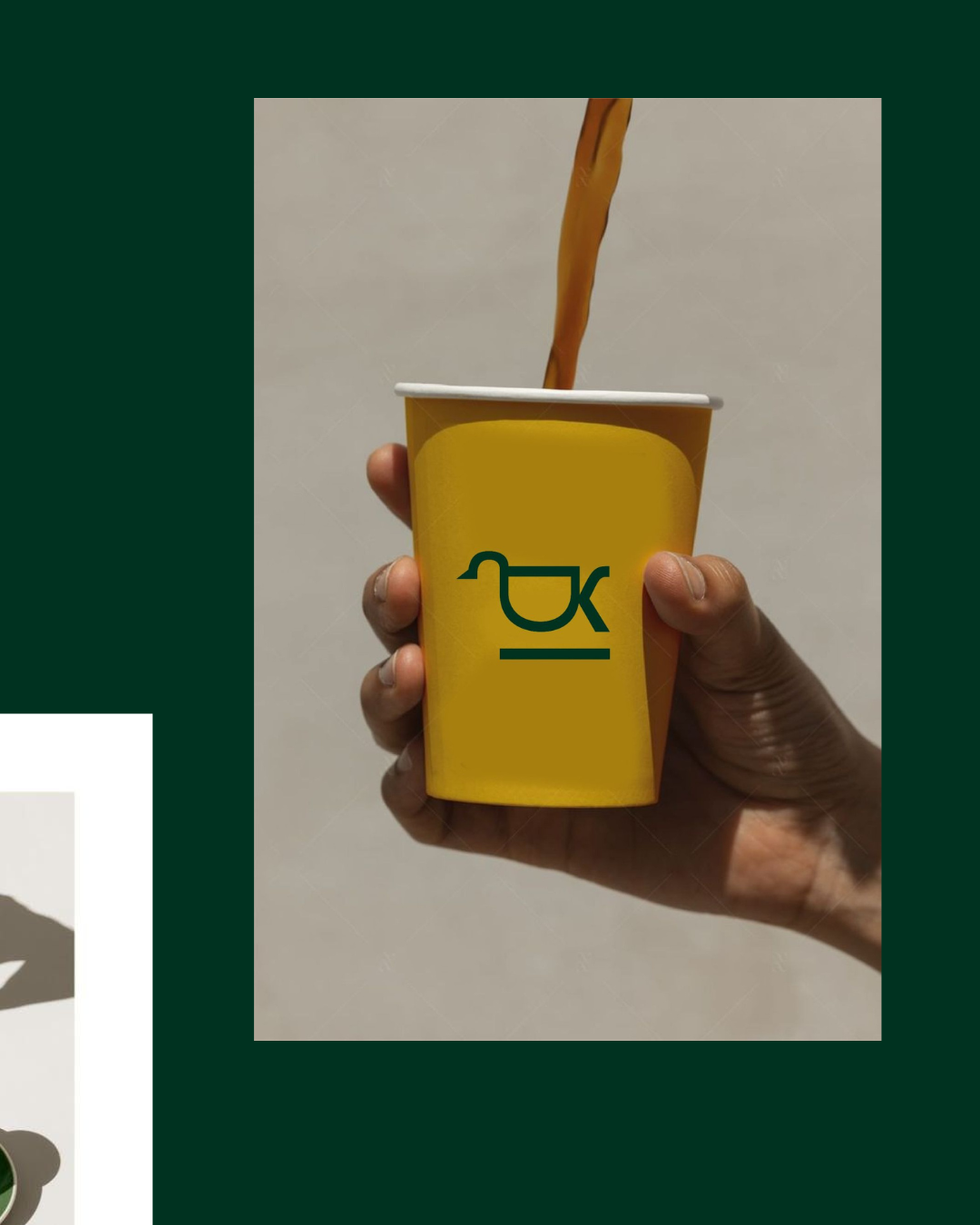
Aam ran three distinct visual directions before landing on the final mark: a colour-led route pulling from Guyana's textiles and markets, a texture-led route built around gold and warm light, and a composition-led route rooted in Guyanese fine art. The founders chose the texture-led direction for its sense of luxury and warmth, and Aam carried it through several rounds of logo development to a clean wordmark paired with an integrated bird-and-cup mark, legible from a napkin to a storefront sign.
Colour & Type
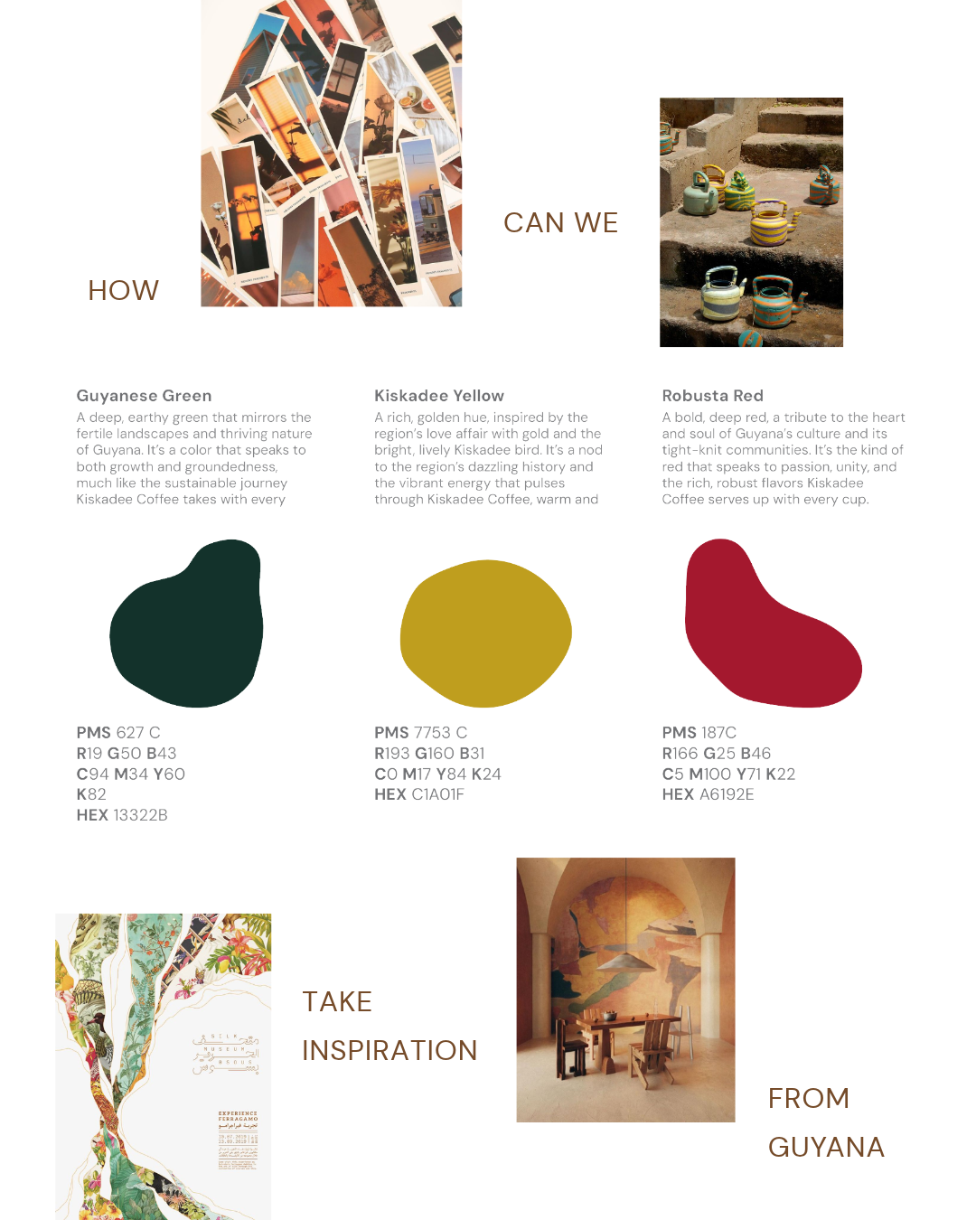
The final palette (deep forest green and warm gold, pulled directly from the Guyanese flag and rainforest) paired with Scale Condensed and Questa Sans gave the brand a voice that felt premium and rooted at once.
Iconography
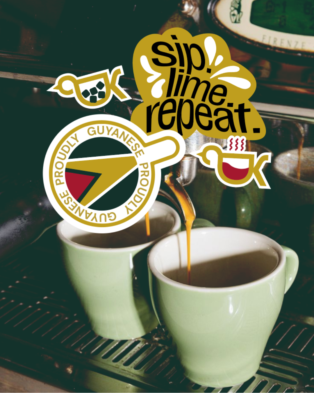
Aam built out a supporting icon set to extend the identity beyond the logo: a hand-lettered "Sip. Lime. Repeat." mark (lime being local Guyanese slang for hanging out), a "Proudly Guyanese" seal referencing the national flag, and a hot-and-cold icon pair built from the logo's own bird-cup monogram. Every asset was designed to work as a sticker, a stamp, or a standalone mark.
PACKAGING & COLLATERAL
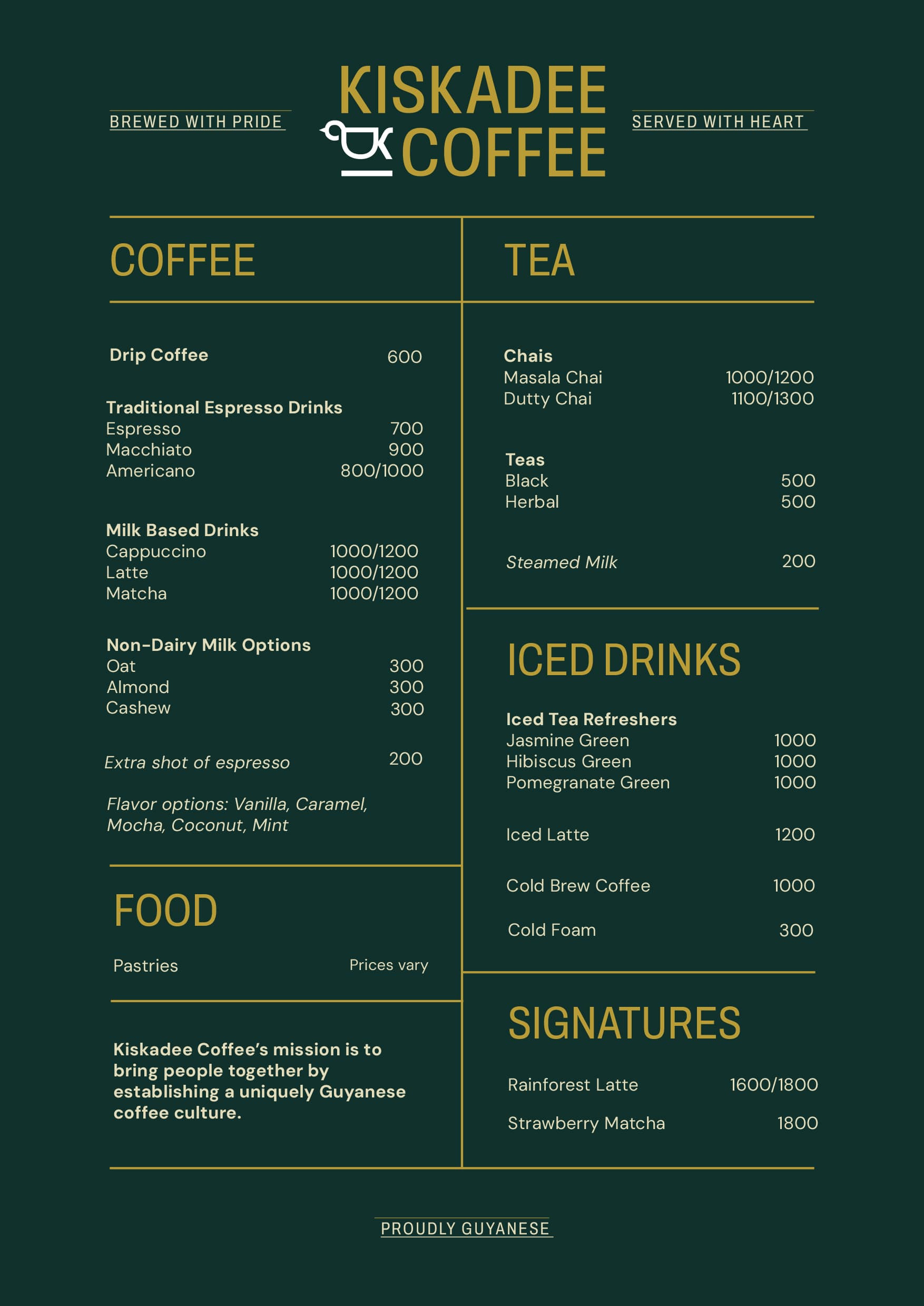
Aam designed the full physical footprint of the brand: cup designs with a built-in intensity meter, a take-away carry bag written in Guyanese Creole ("Bold Brews Fuh De Road"), a tote bag ("Tote This With Style"), and a menu that carries the same green-and-gold system from the counter to the customer's hand.
WEBSITE
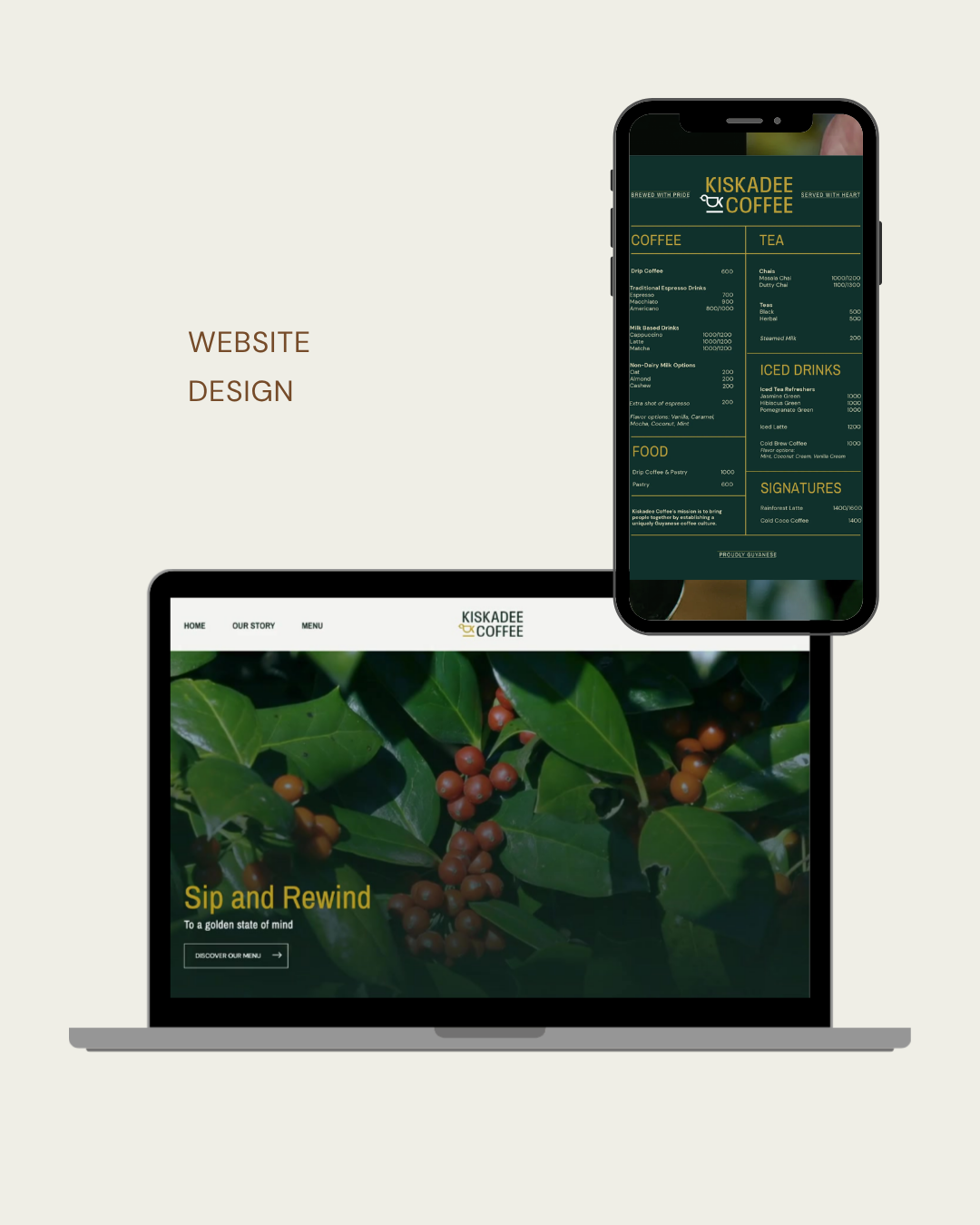
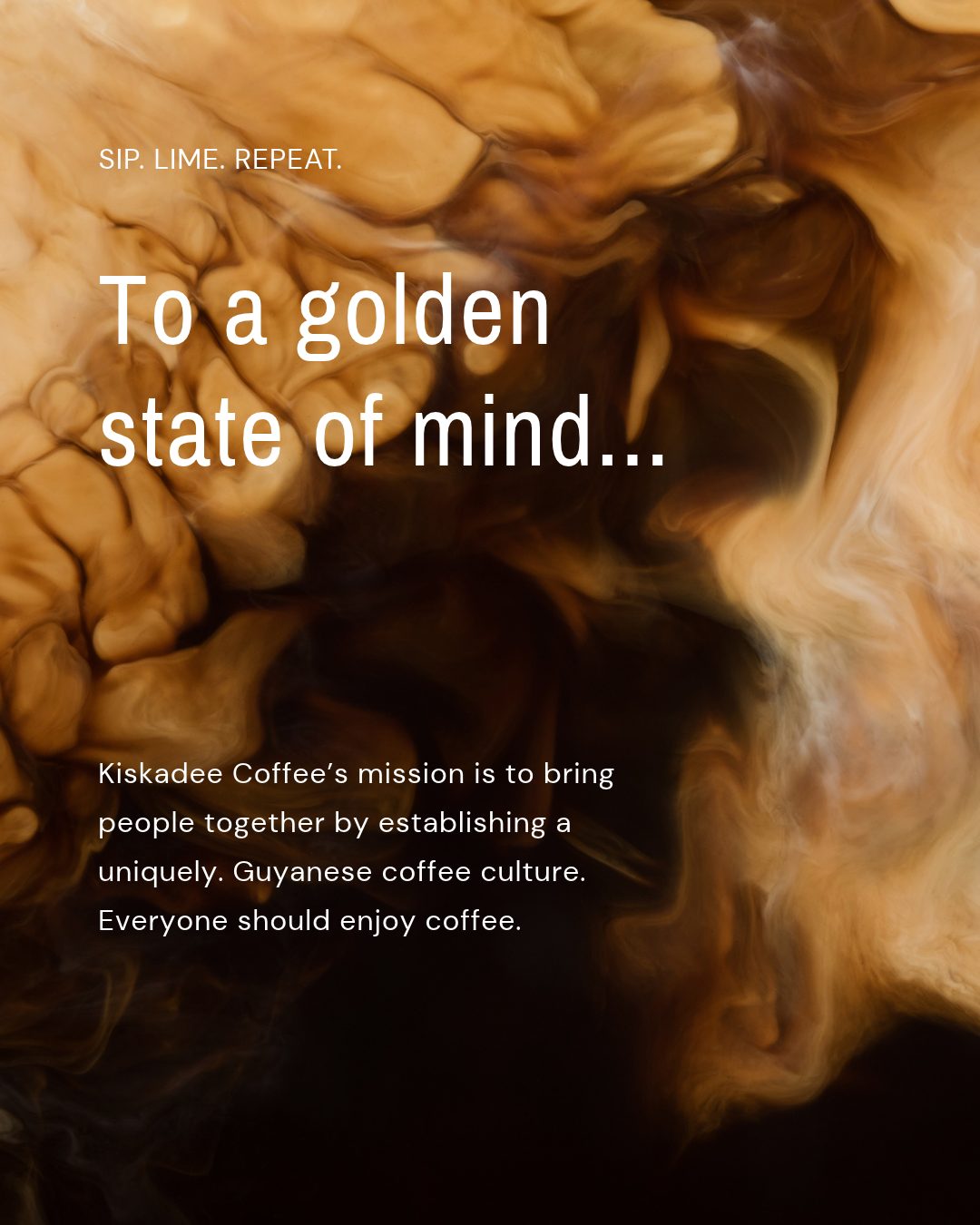
Aam extended the same visual and verbal system into Kiskadee's digital presence, giving the brand a home online that matches the warmth and craft of its physical space.
THE RESULT
Kiskadee launched as one of the first specialty, grab-and-go coffee brands in Guyana, backed by a complete identity system built to scale: a logo, colour palette, and typography system; a full packaging and collateral suite; and a website, all working from the same playbook.
More than a logo, Aam left Kiskadee with a language: a tagline, an icon set, and a copy voice built to grow with the brand as it opens new locations and expands its menu.
PROJECT CREDITS
Creative Direction
Drashti Sheth
Copywriting
Afshan Nasseri
CLIENT
Harsh & Sabrina, Founders, Kiskadee Coffee
Identity & Packaging
Aarushi Agarwal
Website Design & Development
Junaid Tarik