Cardamom Baby
THE OPPORTUNITY
South Asian-inspired children’s products usually land at one of two extremes. Some are overly traditional, and others are stripped of culture for a generic “modern” look. Either way, the stories and craft that make them meaningful get lost.
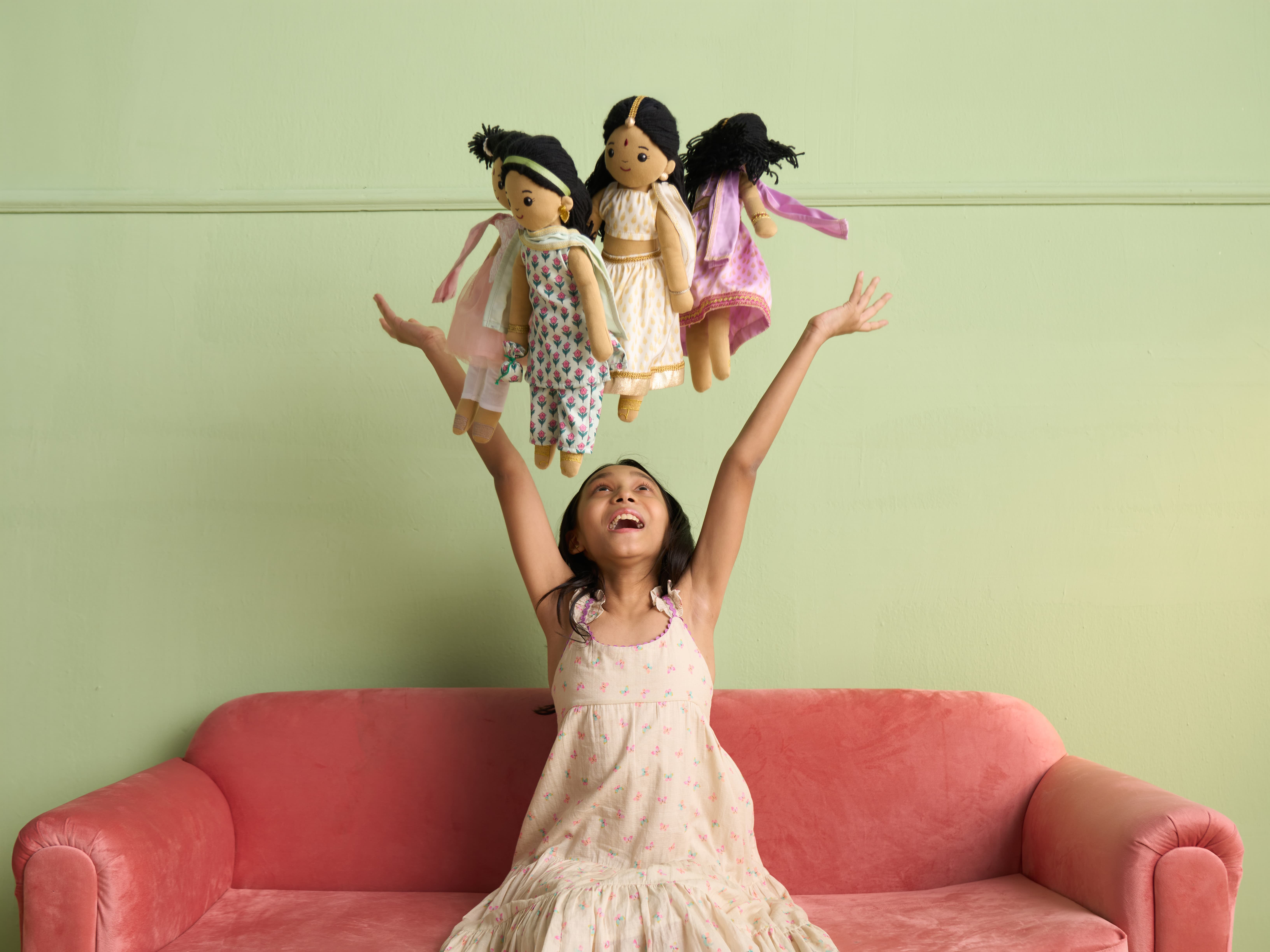
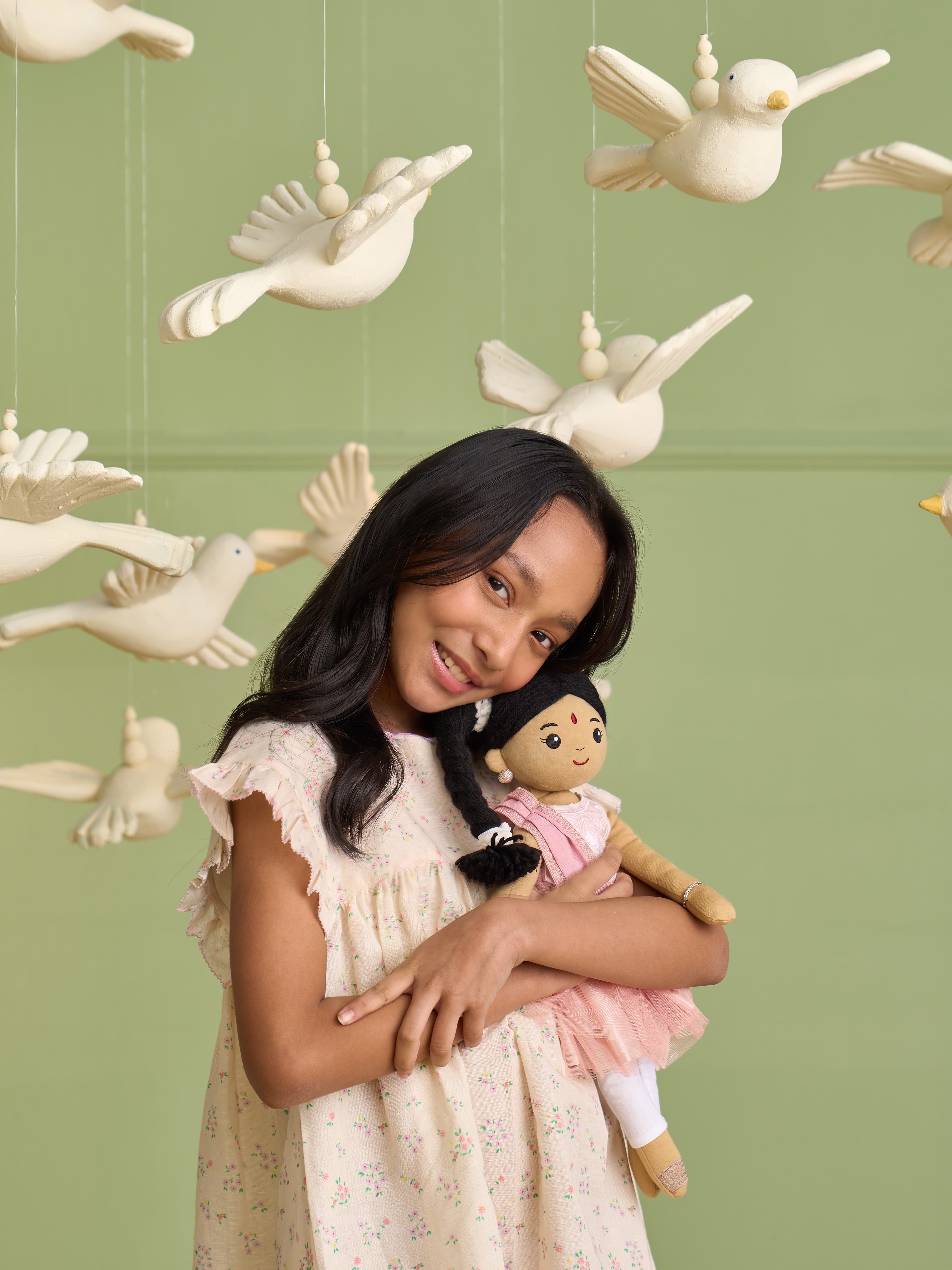
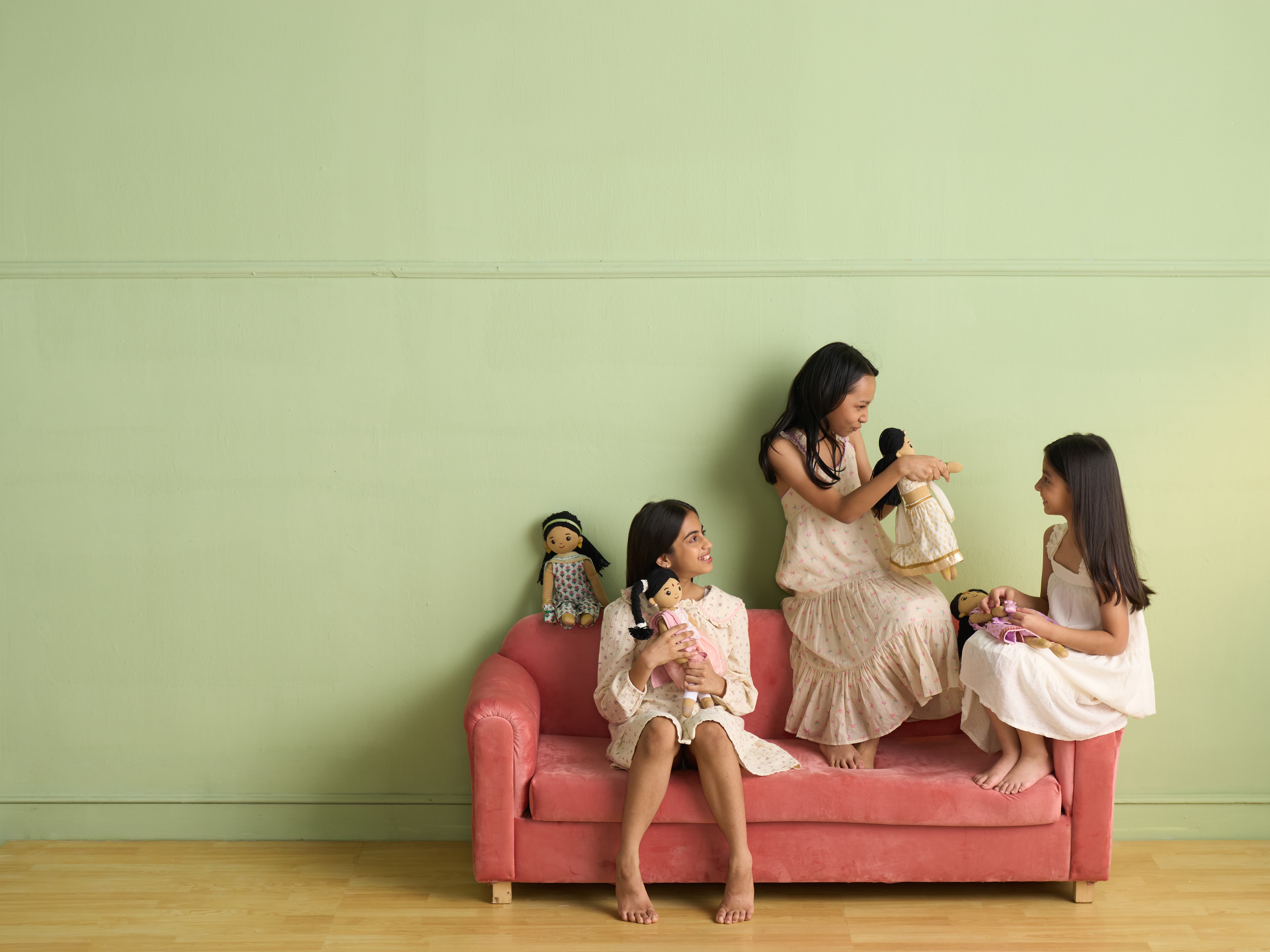
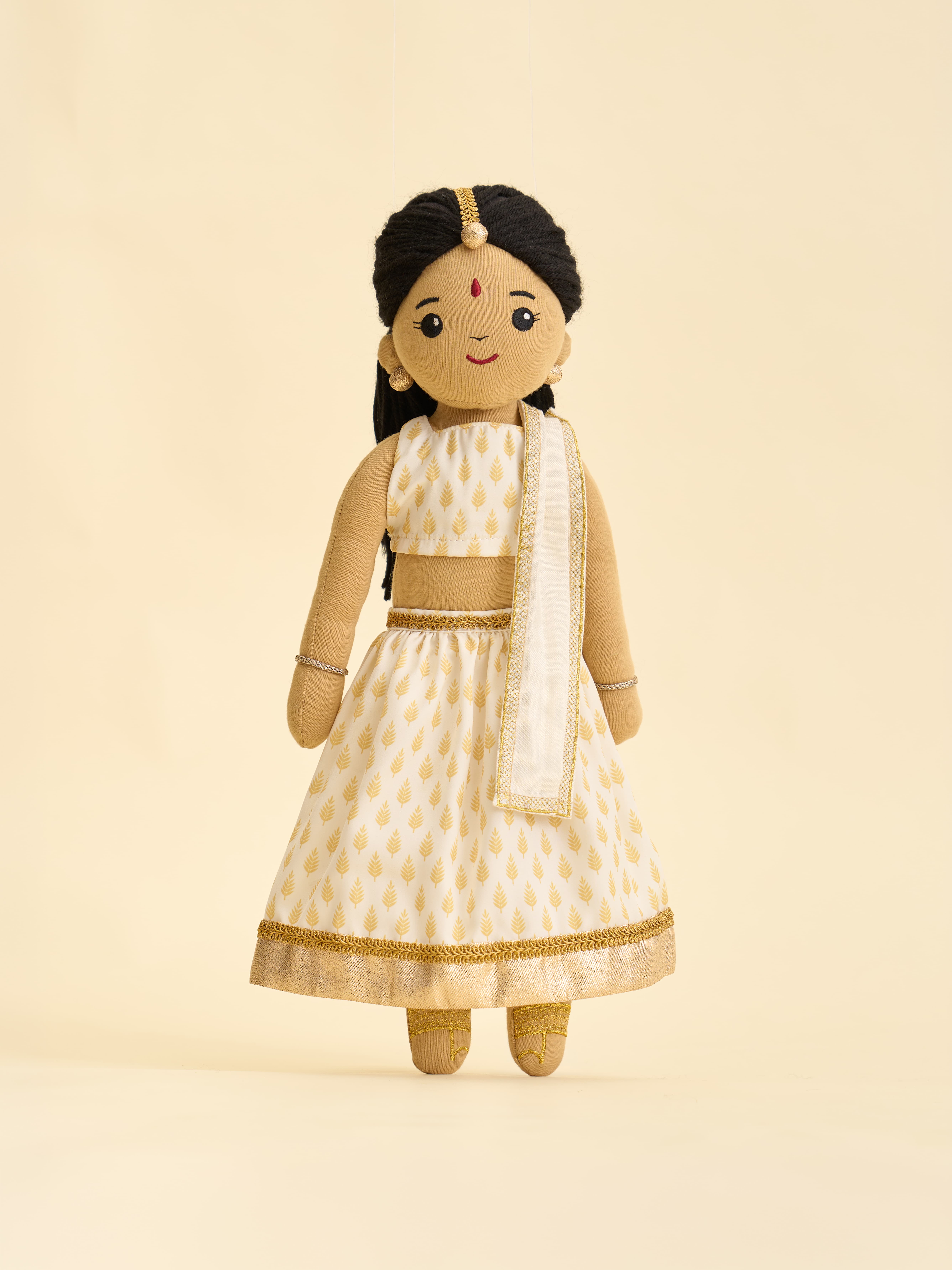
Reena Costello started Cardamom Baby to make heirloom-quality dolls that treat South Asian identity with the same care as the stories families pass down. The idea was culture as something children play with every day, not decoration.
THE GAP
Parents want brands that reflect who they are. But South Asian representation in toys is thin, and what exists leans on ceremonial references that speak more to adults than to children.
Cardamom Baby aimed to be timeless, collectible, and joyful for any child, not niche or nostalgic.
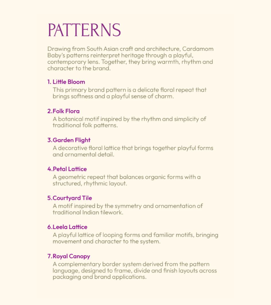
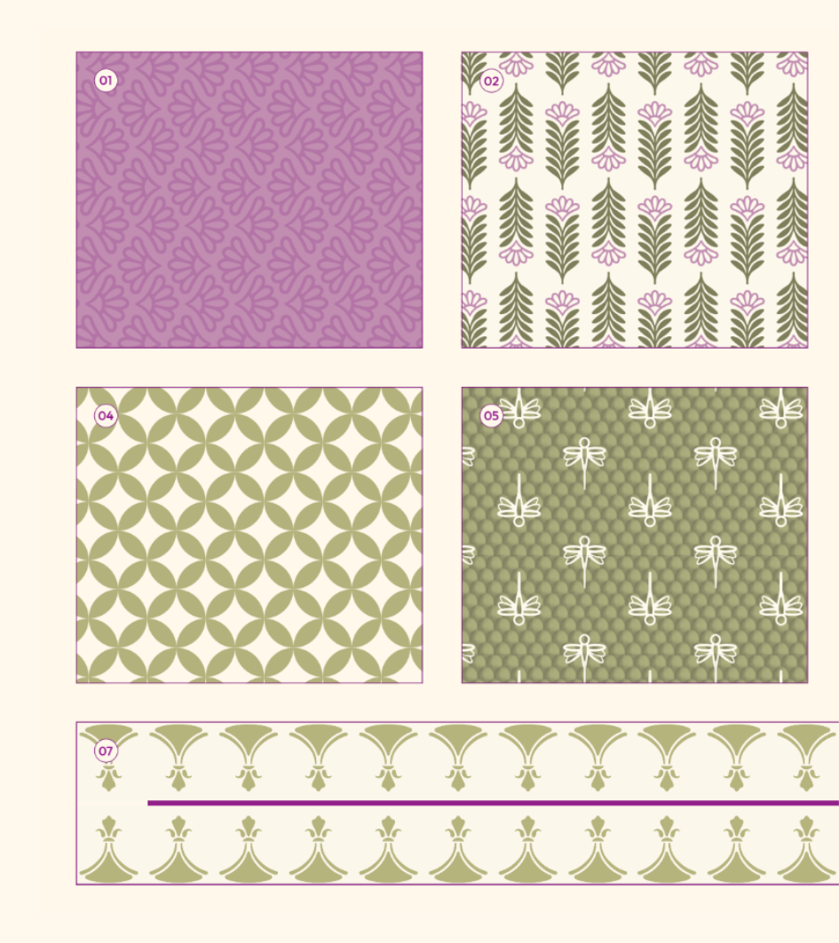
STRATEGY
We positioned Cardamom Baby as a family brand rather than a toy company, so it could grow past dolls into books, gifts and accessories. Beyond being played with, the Cardamom Baby dolls also served as beautiful decorations to a home. The creative territory came from the worlds children invent for themselves, with handcrafted South Asian artistry given a contemporary treatment.

IDENTITY
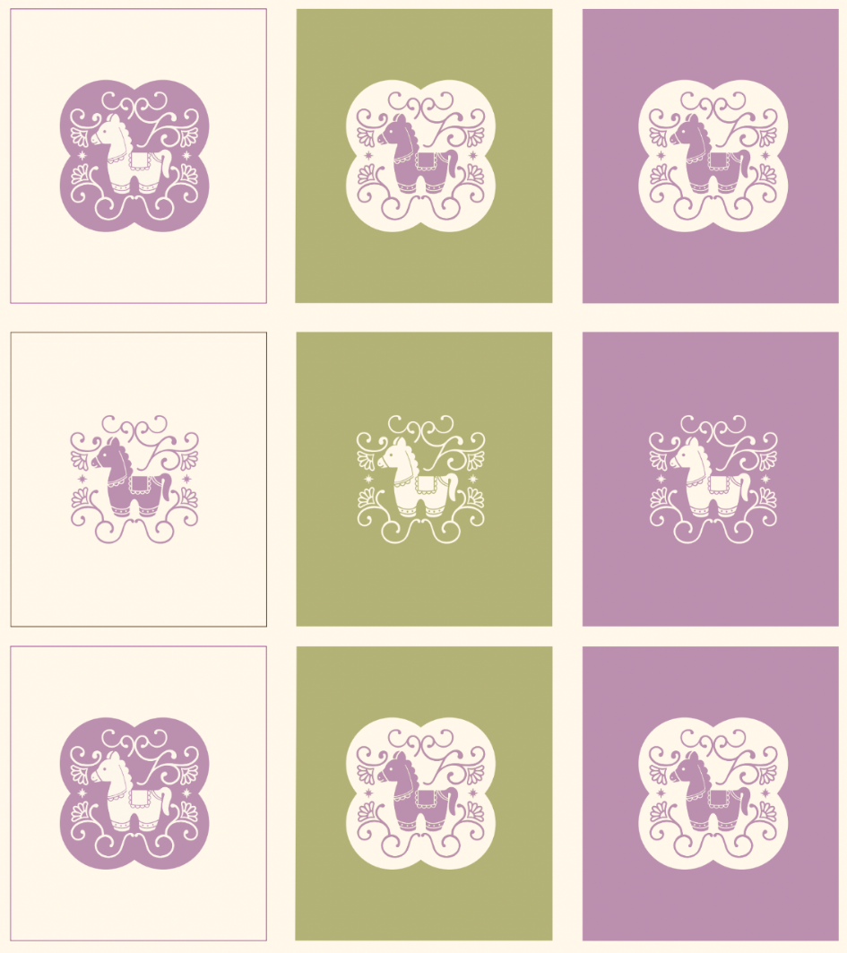
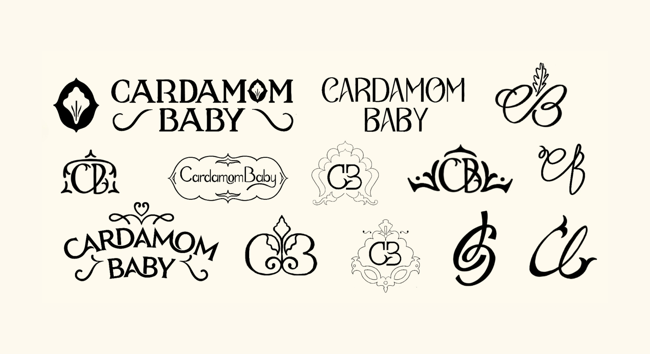
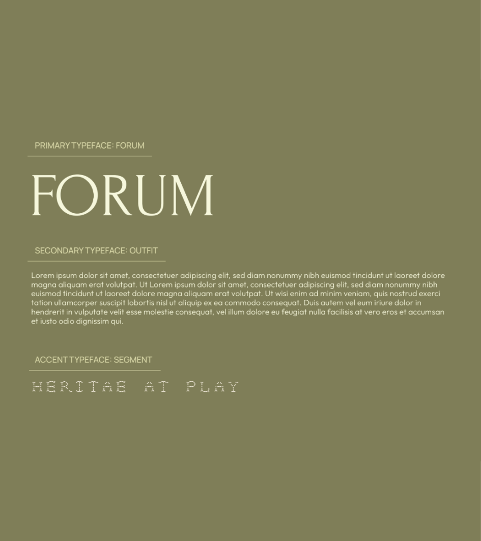
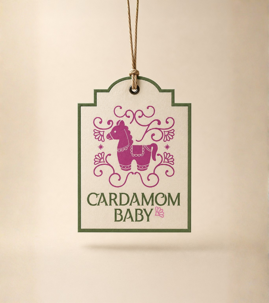
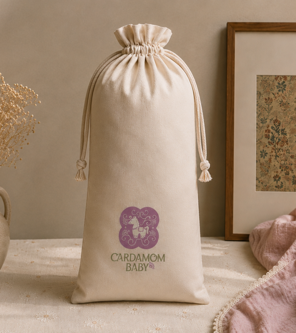
The symbol is a floral form that echoes a cardamom pod opening, paired with elegant type. It’s refined enough for parents and warm enough for kids.
Instead of saturated festival colours, we used softened lilacs, sage, warm coral and cream, drawn from textiles, architecture and handmade craft.
The voice sounds like a family keepsake, not a toy brand. It’s warm and curious to welcome parents and children into the world.
PACKAGING
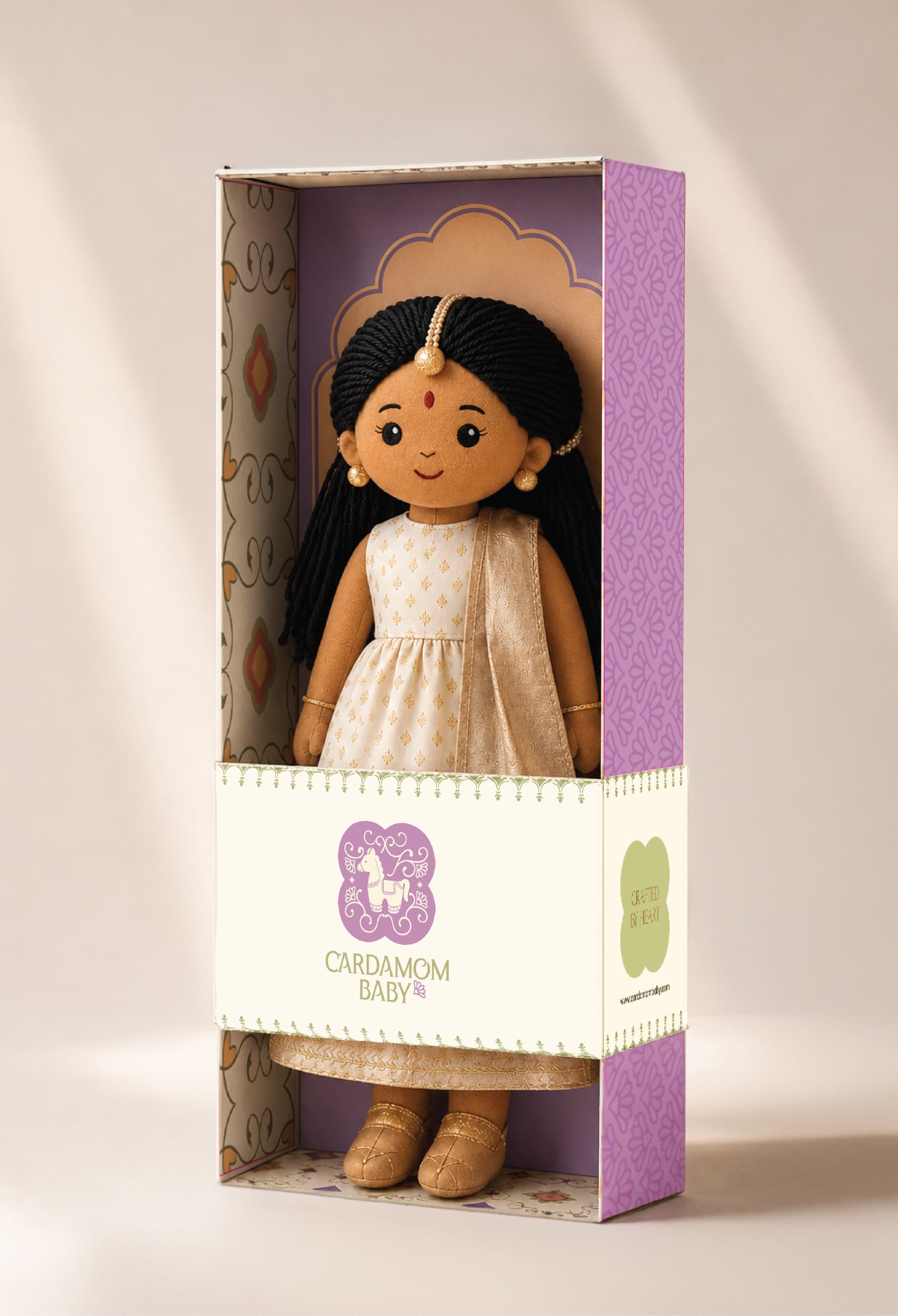
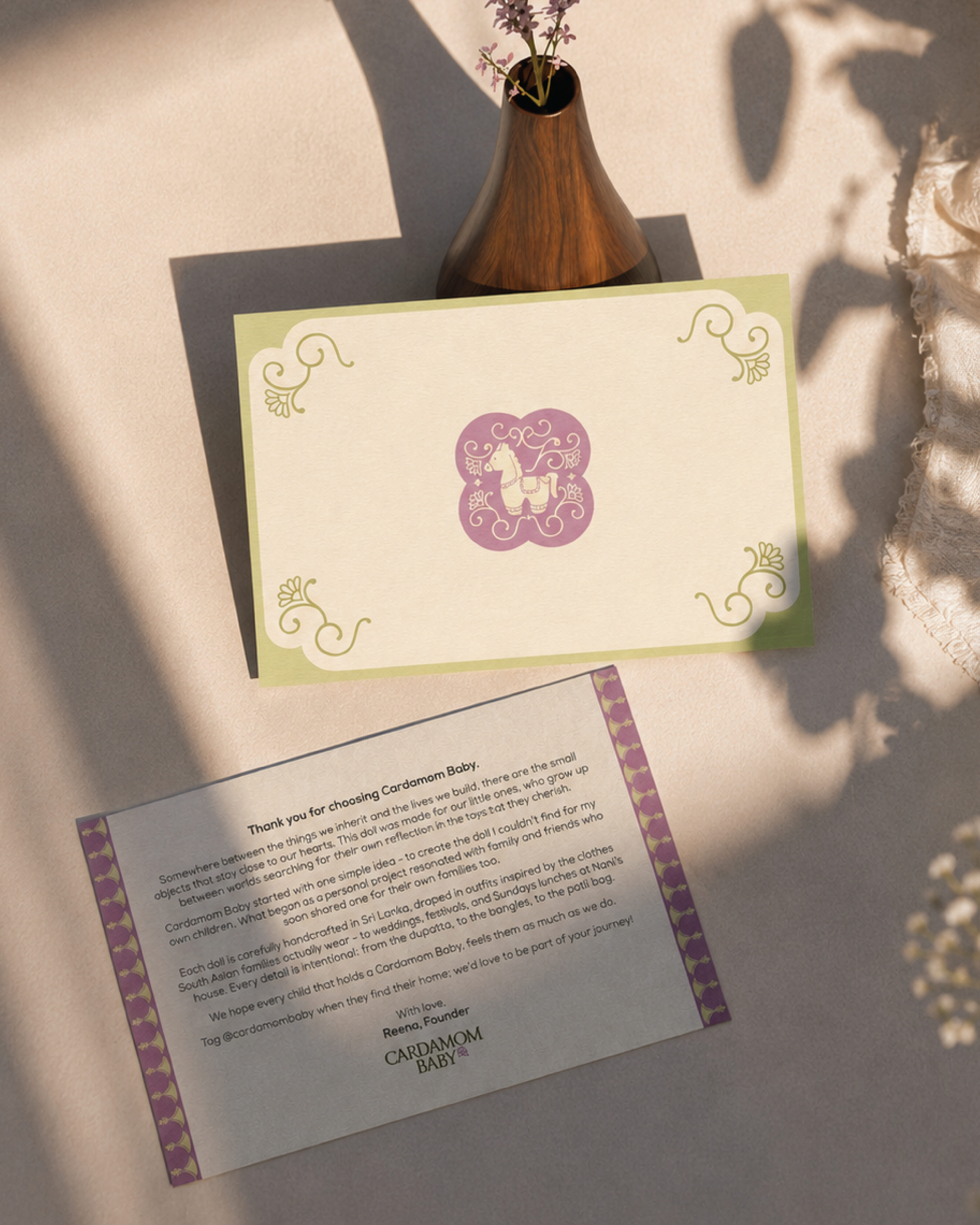
Opening the box should feel like receiving a treasured gift. Illustrated frames borrow from South Asian architecture and textiles; the patterns stay quiet, and generous white space keeps the doll the hero. The system stretches across clothing, stationery and future collections without losing its look.
WEBSITE
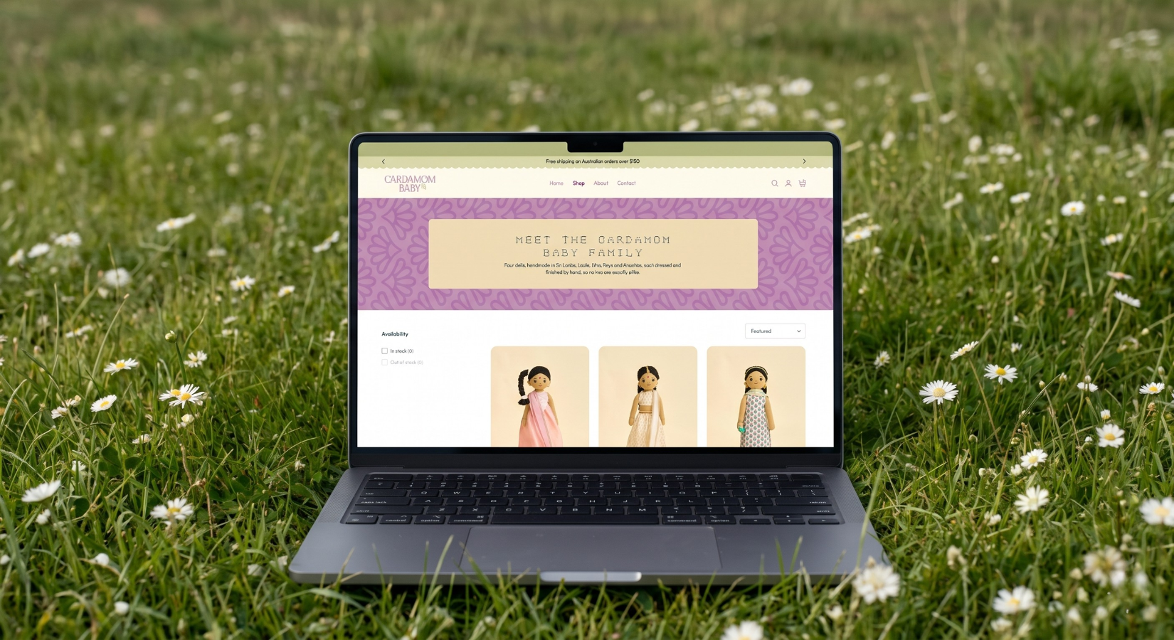
The site sells and tells the story. It covers the craft, cultural inspiration, and meaning behind each collection in the same visual language as the packaging.
THE RESULT
A brand built to grow from one doll into a family of products without losing the idea it started with: keepsakes that carry culture from one generation to the next.
PROJECT CREDITS
Creative Direction
Drashti Sheth
Identity & Packaging
Nikita Savla & Priyansh Adeshra
Website Design & Development
Junaid Tarik
Photoshoot Management & Styling
Prerna Narang
Copywriting
Aiman Rizvi & Afshan Nasseri
Client
Reena Costello