Atrangi
THE APPROACH
Indian food in the UK had lost its way, and decades of shorthand, greasy, overly spicy, one-note had flattened a cuisine of enormous regional range into a stereotype. While other global food cultures had found their way into quick, modern, health-conscious kitchens, Indian food hadn't been given the same space, and the condiments aisle in particular had gone quiet: safe, beige, forgettable.
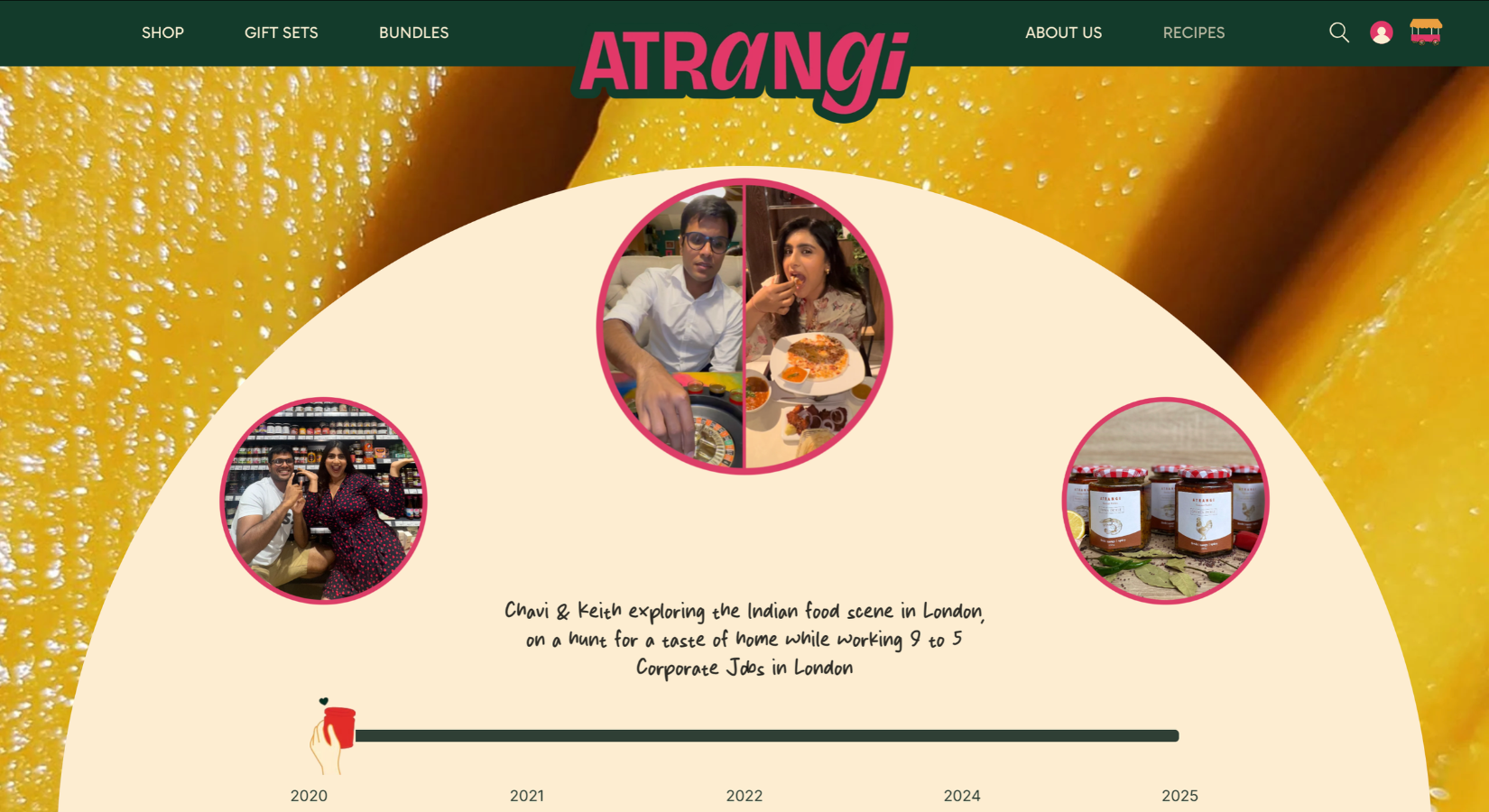
For Chavi and Keith, this wasn't an abstract category problem. Both had immigrated to London and met there as overworked corporate professionals, homesick for the food they'd grown up with. One winter night, a spoonful of Keith's father's Mango Masala Chutney, a three-generation family recipe from Pondicherry, turned a tired stir-fry into something worth stopping for. That was the spark: if this jar could do that at their own kitchen table, it deserved a shelf, and a brand, of its own.
That's where Aam came in, brought on to build the brand, identity, packaging, and website from that single family recipe outward.
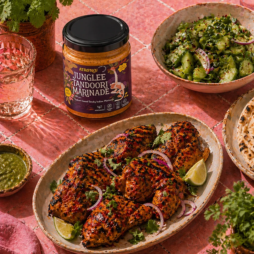
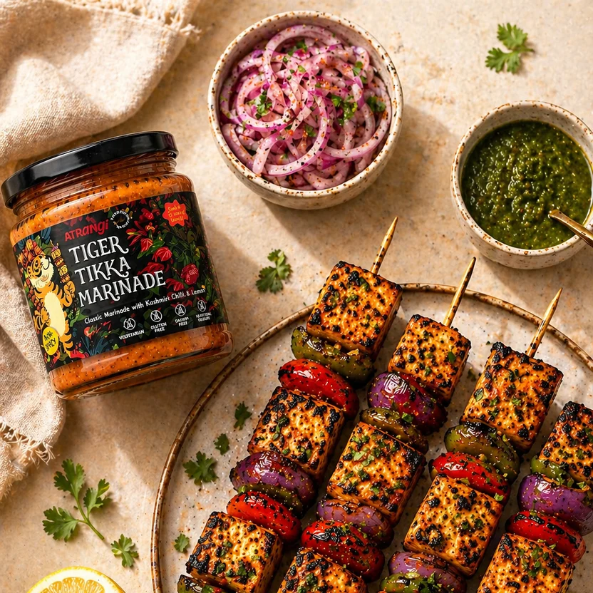
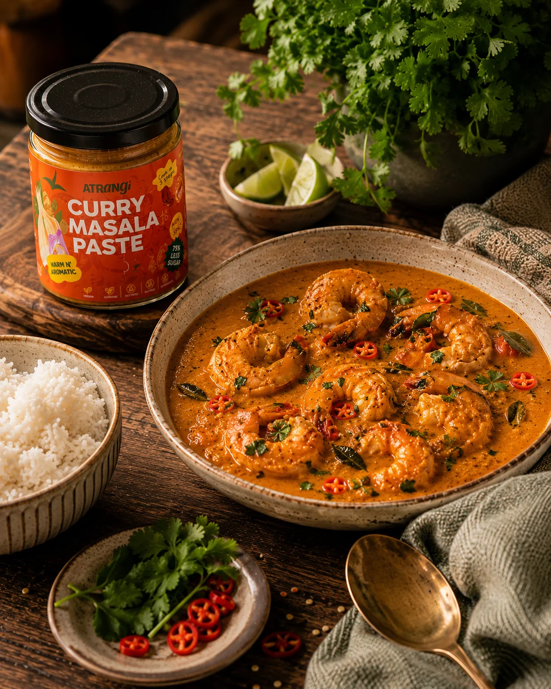
A CATEGORY READY TO BE DISRUPTED
Britain's chutney and curry-sauce aisle is dominated by a handful of long-established names, alongside a growing wave of independent, market-stall-born brands looking for real shelf space. Consumers increasingly scan front-of-pack for clean-label signals: made in the UK, low sugar, gluten-free, vegan, before they scan for flavour. And Indian food, specifically, carries decades of accumulated stereotypes that a new entrant either fights or ignores.
Atrangi chose to fight it, loudly. The opportunity was a brand with enough personality to earn attention at a farmers-market table, and enough clarity to earn a repeat scan in a supermarket aisle.
BRAND STRATEGY
Brand purpose: to put the real, three-generations-deep flavor of Indian home cooking back in a British kitchen, unapologetically, without diluting it for anyone. Atrangi means, roughly, "colorful," "quirky," "out of the ordinary", a word used affectionately in Hindi for something a little larger than life.
It set the brief for everything downstream: a name and a brand that could say bold ingredients, no rules, and mean it.
BRAND IDENTITY
Wordmark
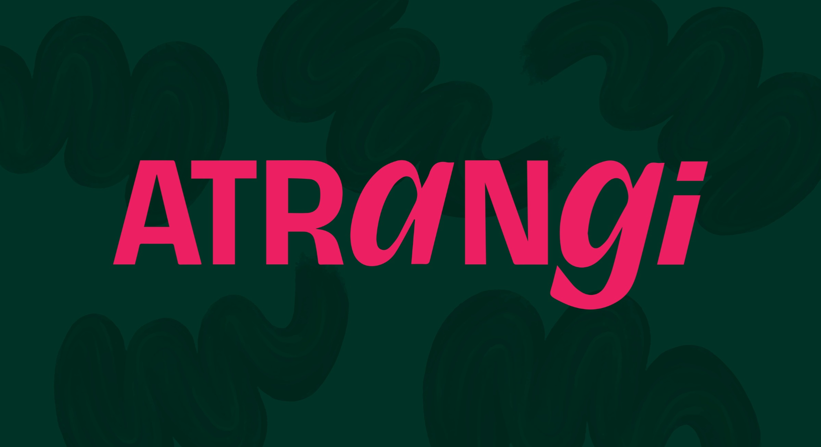
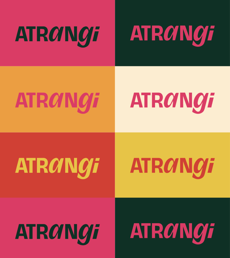
The name carries the strategy on its own, so the mark was built to be confident and legible first: a logotype that reads well shrunk onto a jar lid as easily as it does on a market-stall banner.
Colour and tone
The palette draws from the ingredients themselves- tomato, mango, chilli, tamarind, rather than a generic "Indian restaurant" red-and-gold cliché, giving the brand a contemporary, appetite-driven warmth that photographs well in both a studio shot and a phone snap at a market stall.
Voice
Playful, direct, a little cheeky ("Curry in a Hurry," "Making Chutney Cool Again," "Flipping the Script on Condiments"), designed to sound like the people actually behind the jars rather than a corporate food brand.
PACKAGING
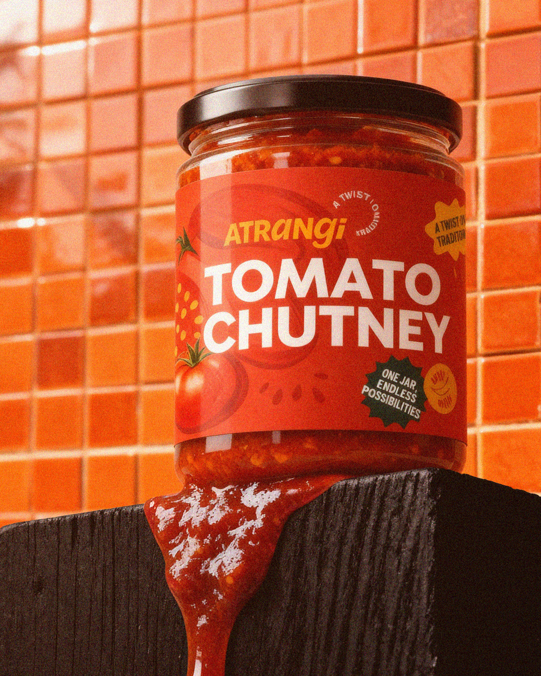
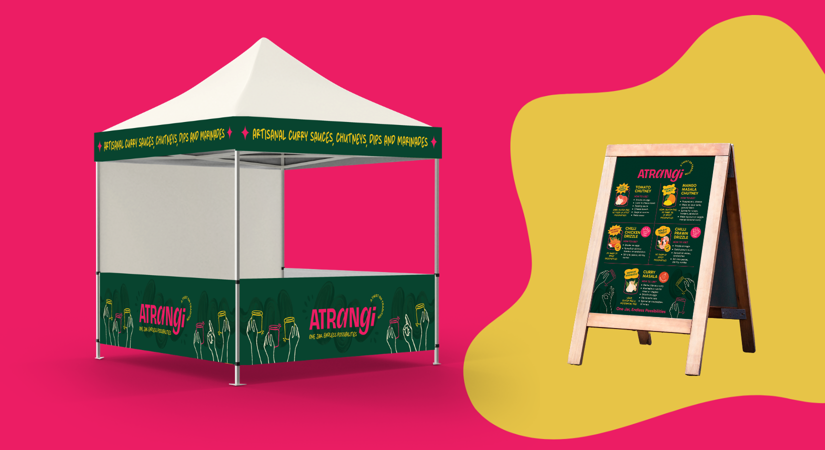
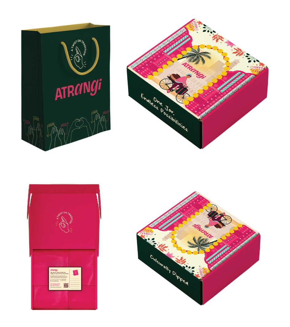
The jars had to do two jobs at once: stand out on a crowded farmers-market table next to a dozen other small producers, and hold their own on a supermarket shelf against long-established names.
Aam's packaging work focused on:
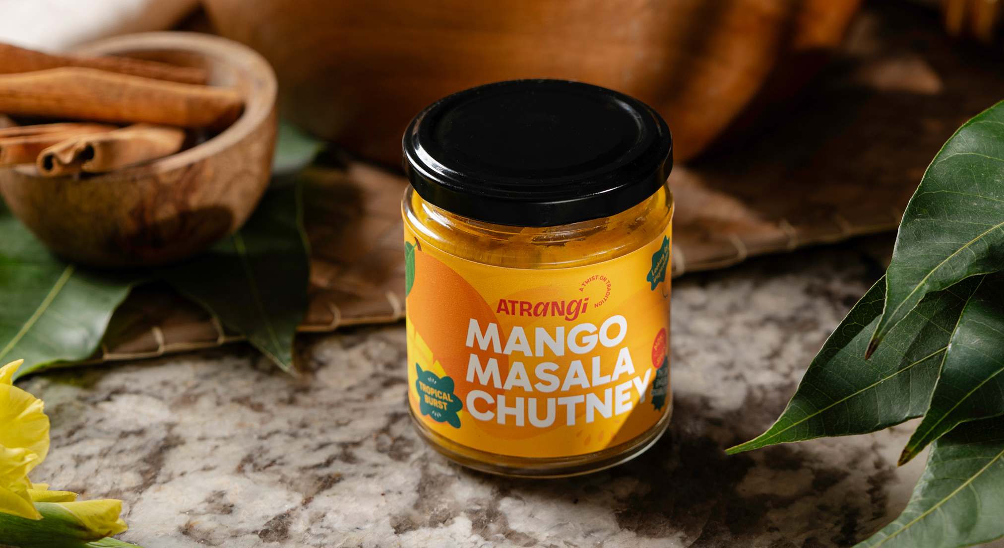
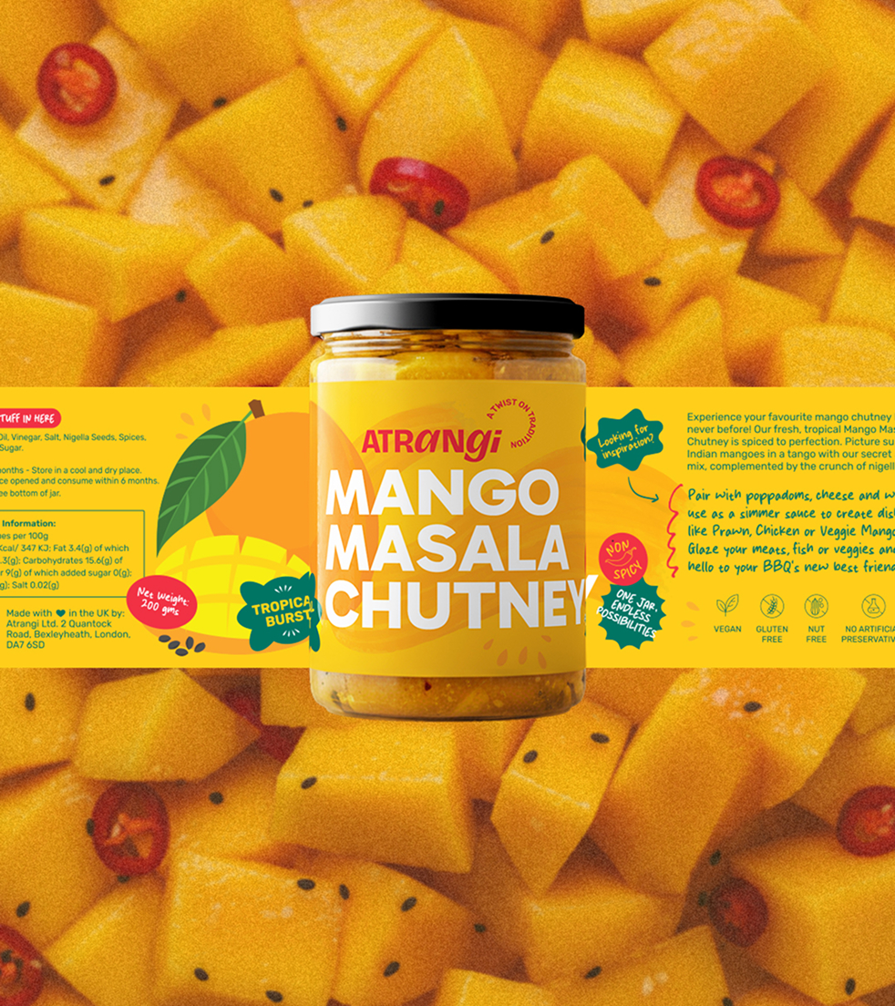
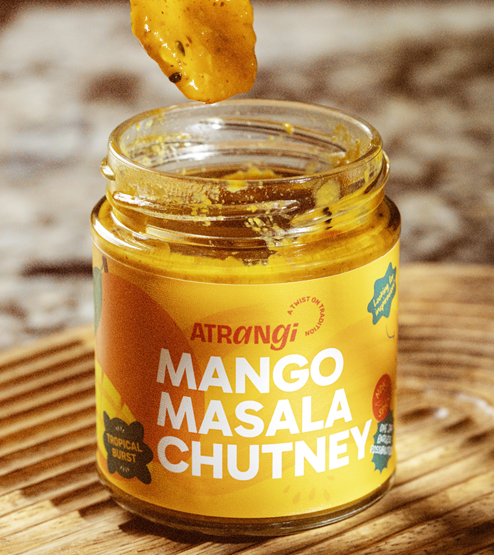
A label system built around bold, appetite-led colour and clear product naming, legible at market-stall distance.
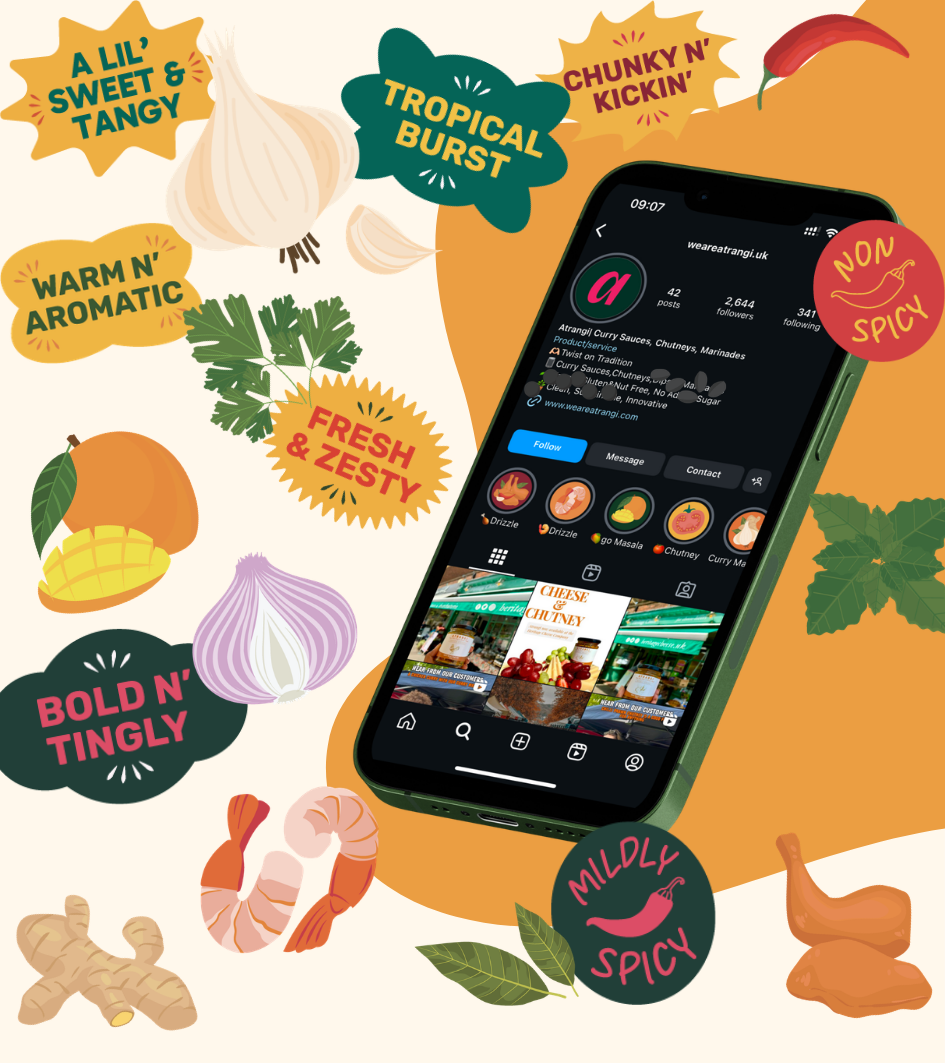
Front-of-pack functional badge system, made in the UK, low sugar, gluten-free, vegan, nut-free, gut-friendly, so the clean-label case is made at a glance, not buried in small print.
A structure that could flex across the current range (chutneys, curry sauces, marinades, pastes) without needing a new system for every new flavour.
WEBSITE
Atrangi's site was built to carry the same energy online: a Shopify storefront structured around shop, gift sets and bundles, alongside a recipes section and an events-and-markets locator that reflects how the brand actually sells, in person, at farmers markets and food festivals across the UK, as much as online. A running community wall, "The Atrangi Clan", turns real, unscripted customer messages and market photos into the site's most persuasive content, letting the brand's word-of-mouth reputation do the selling.
THE RESULT
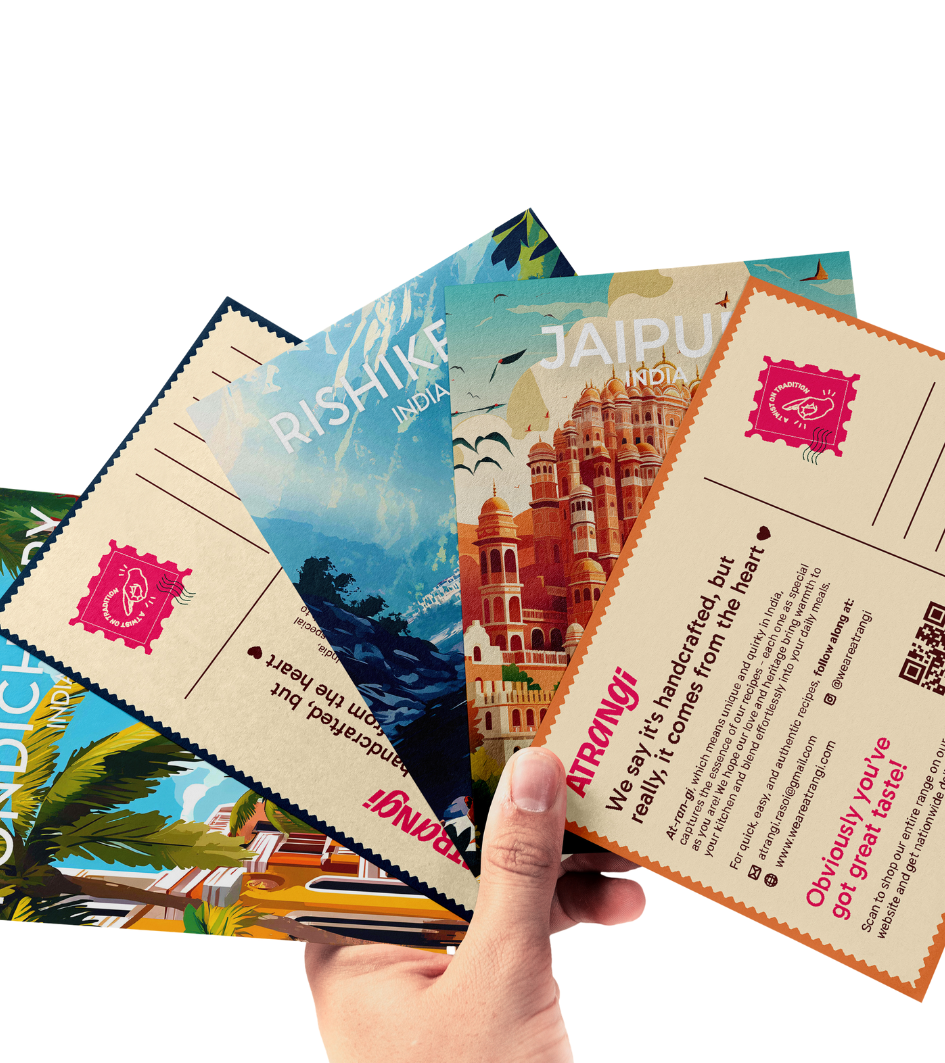
Atrangi now shows up nationwide, from London farmers markets to festivals like Blenheim Palace and the BBC Good Food Show, carrying one consistent brand across every touchpoint: jar, stall, and screen.

We really appreciate our collaboration and you being flexible with us! Thanks for that always 🫶🏻
PROJECT CREDITS
Creative Direction
Drashti Sheth
Packaging
Maitreyee Kshirsagar & Priyanka Pachpande
Brand Strategy & Copywriting
Afshan Nasseri, Masuma Ali & Masumah Pirbhai
Website Development
Junaid Tarik
Identity
Maitreyee Kshirsagar
Illustrations
Adinda Shafira & Tamannah Bhatia
Website Design
Mahima Dhawan
Client
Chavi & Keith