Ark
THE OPPORTUNITY
Most non-alcoholic innovation is about replacing alcohol, not creating something new. And South Asian flavours, though increasingly mainstream, still tend to show up as nostalgic imports or overly traditional products.
Ark, from the Hindi word for essence, turns traditional South Asian drinks into modern sippers. Both the product and the brand identity needed to be re-examined.
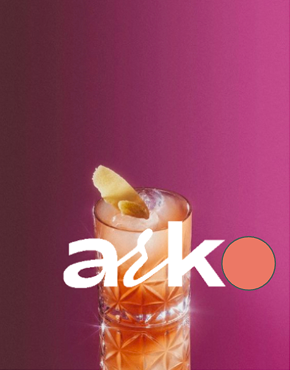
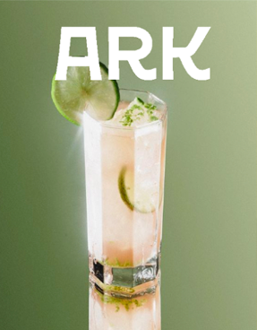
REFINEMENT: NOT REINVENTION
The job was to elevate an existing brand, not build a new one.
Consumer interviews made the problems clear. Flavours were hard to tell apart, the type was hard to read, the logo felt dated, and nothing about the look signalled the quality inside. The heritage was there, but only as decoration. There was no real story being told with the current visual identity.
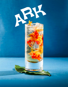
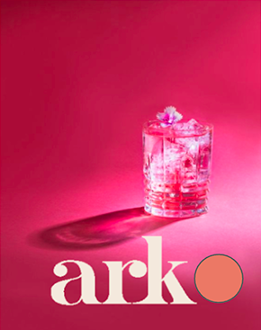
STRATEGY
People cared about flavour clarity, ingredient transparency, and considered presentation, not abstract names or ornamental packaging. So we led with flavour. The founder’s story and heritage became part of the experience, not the whole message.
IDENTITY
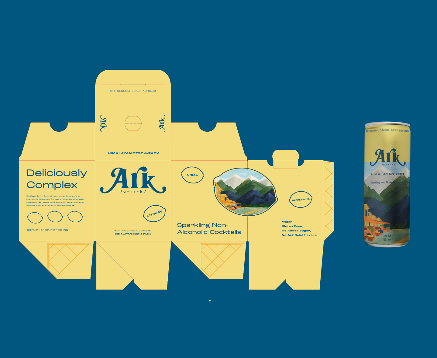
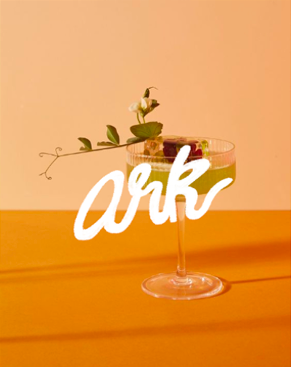
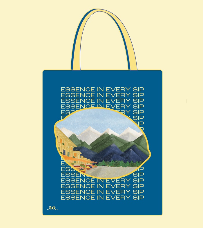
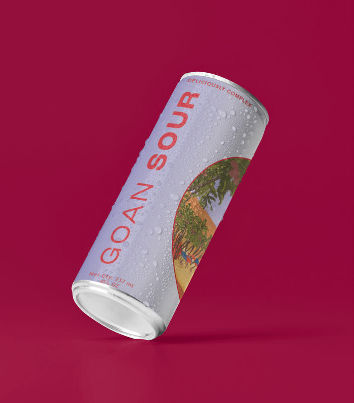
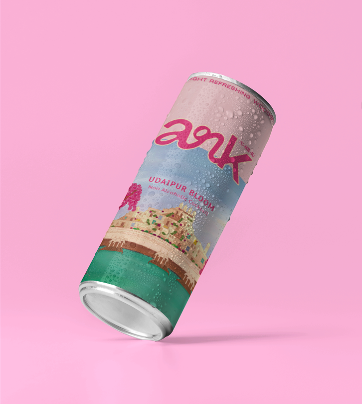
A more confident wordmark, a clearer type hierarchy, and a visual language drawn from quintessential South Asian sceneries, ingredient illustration, and storytelling traditions. We avoided the expected cultural clichés and balanced nostalgia with restraint to truly paint a picture of what it's like to indulge in a can of ark.
PACKAGING
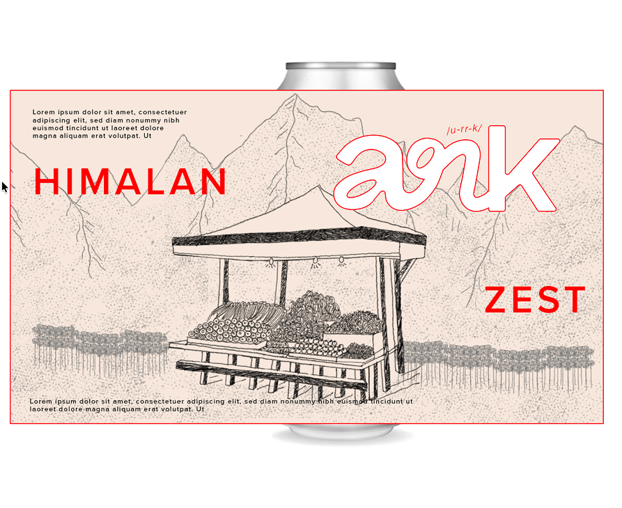
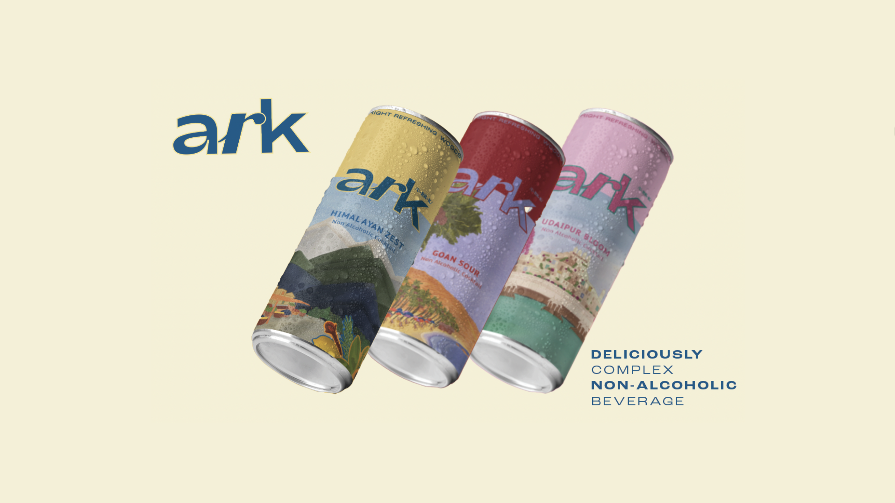
This is where the strategy does its work. Flavour comes before brand in the hierarchy, each flavour stands apart across the range, and ingredient-led illustration tells you what you’re about to taste before the first sip.
RESULT
An identity that finally matches what’s inside.
PROJECT CREDITS
Creative Direction
Drashti Sheth
Market Research
Aditi Bhandari
Identity & Packaging
Mahima Dhawan
Client
Pranali Choubal